LunchBox 2.0
Client: Lunchbox, restaurant

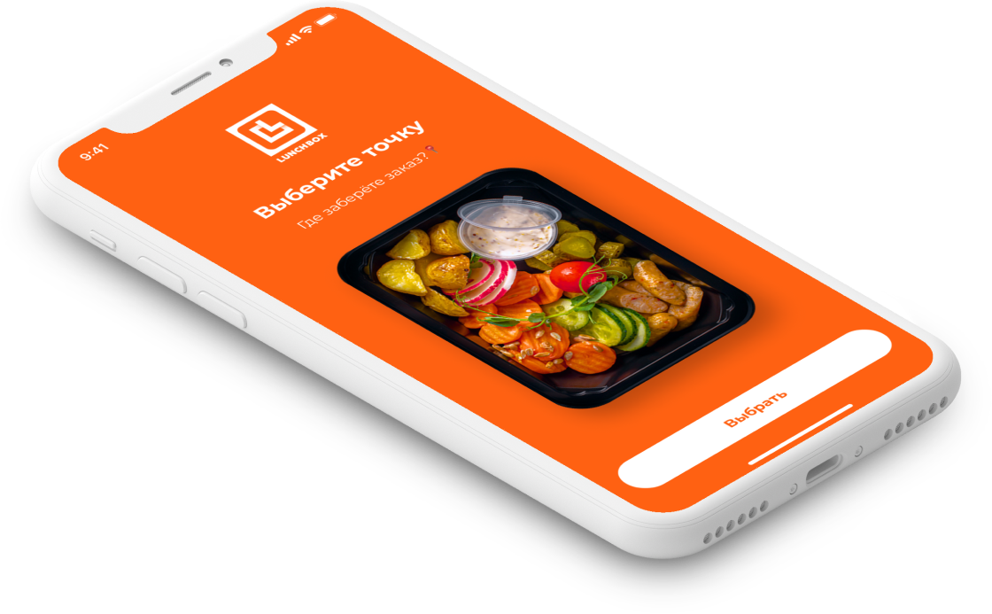
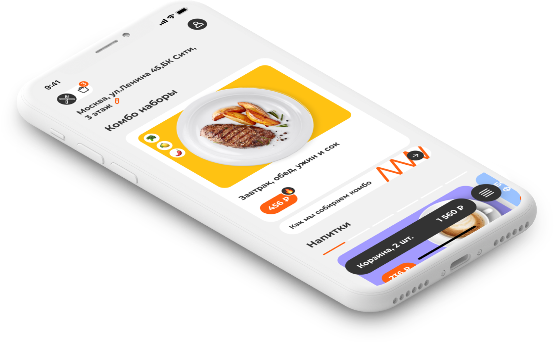
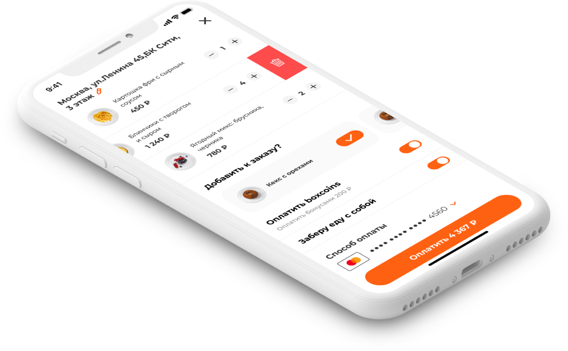
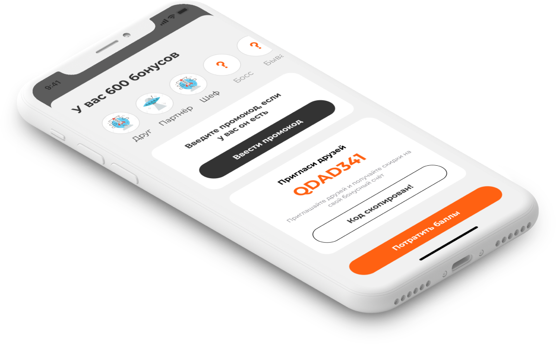
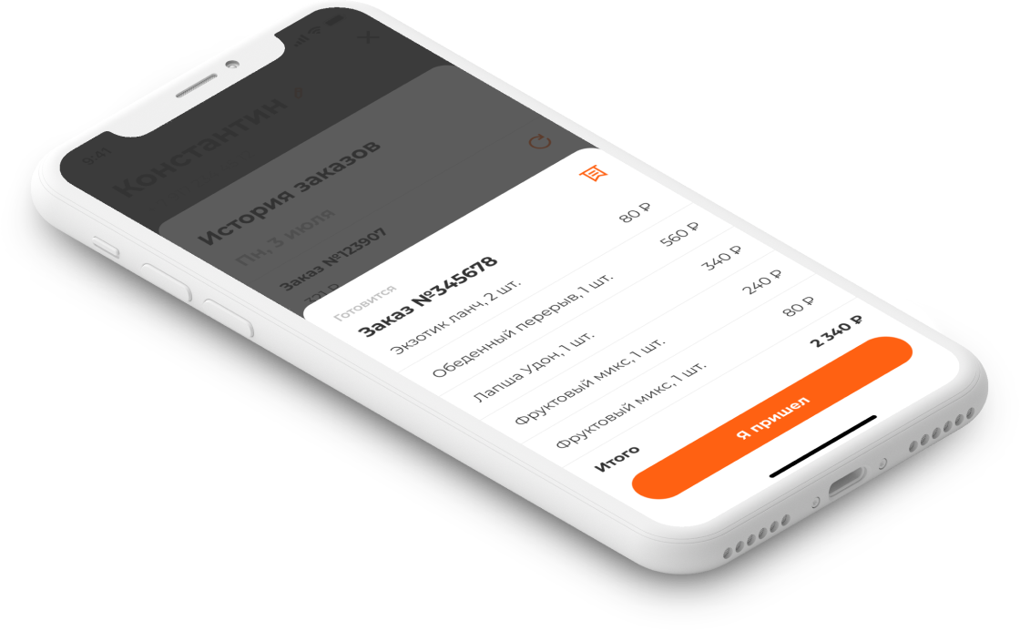
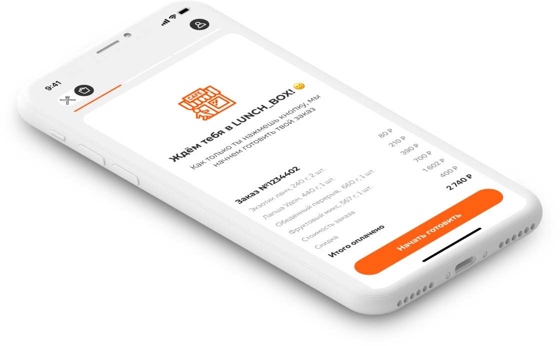
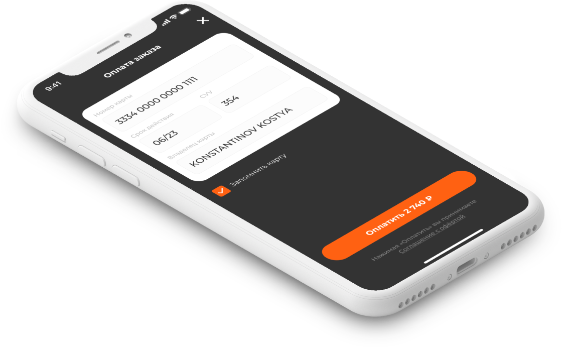
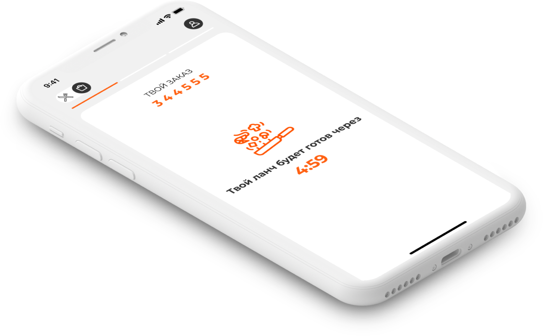
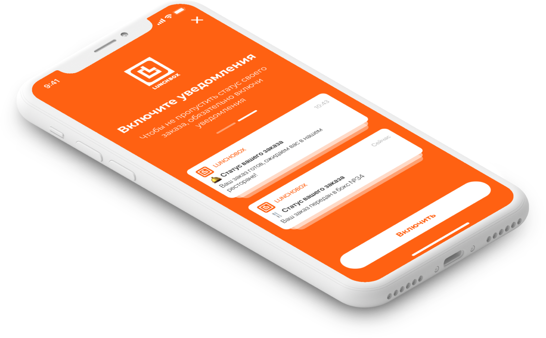
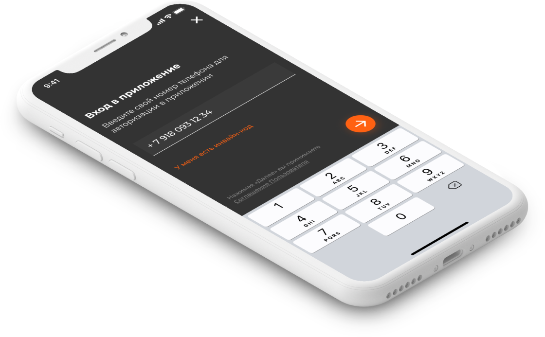
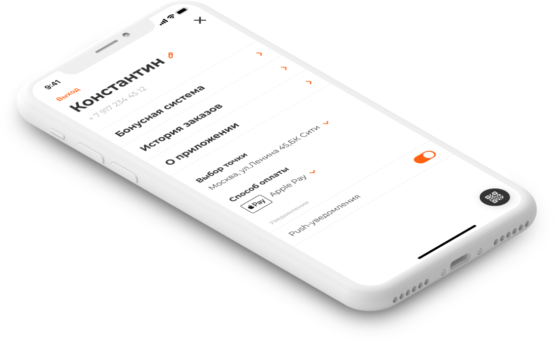
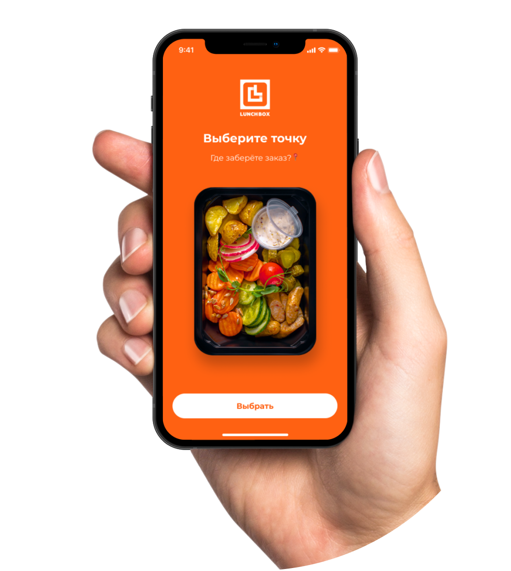
The LunchBox has changed its corporate identity. Together with the update of the app's style, we have revised the main screen, placing additional emphasis on the best offers, combos and promos.
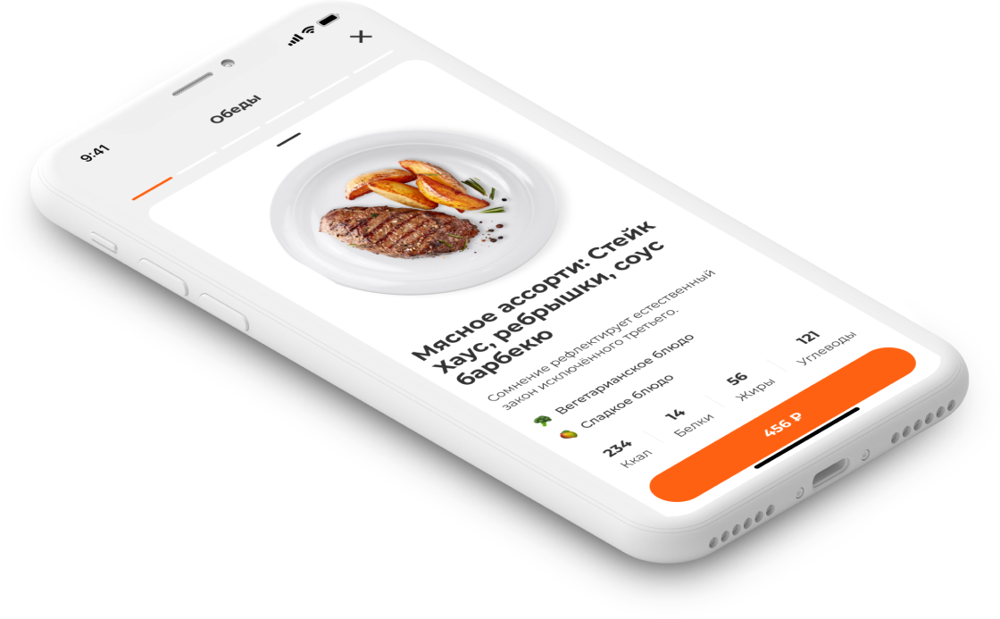
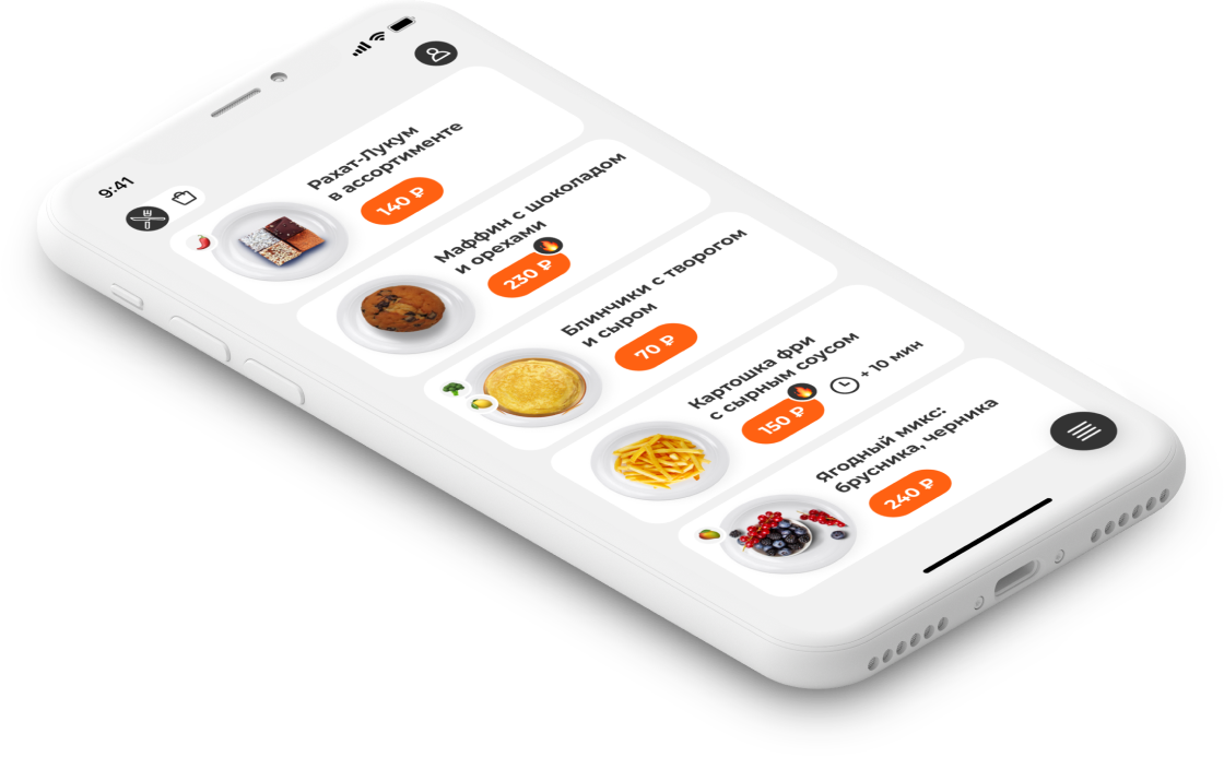
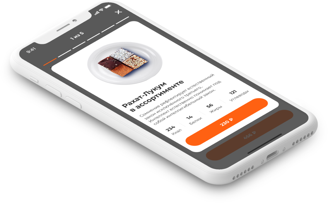
Flypages have become larger, show dishes better, and navigation has become easier through the entire chain of steps from selecting a dish to visiting a cafe, so as not to force the client to think about the interfaces.
The app is made according to the latest guidelines of iOS and Android, so that it rises as high as possible in the stores' ratings.
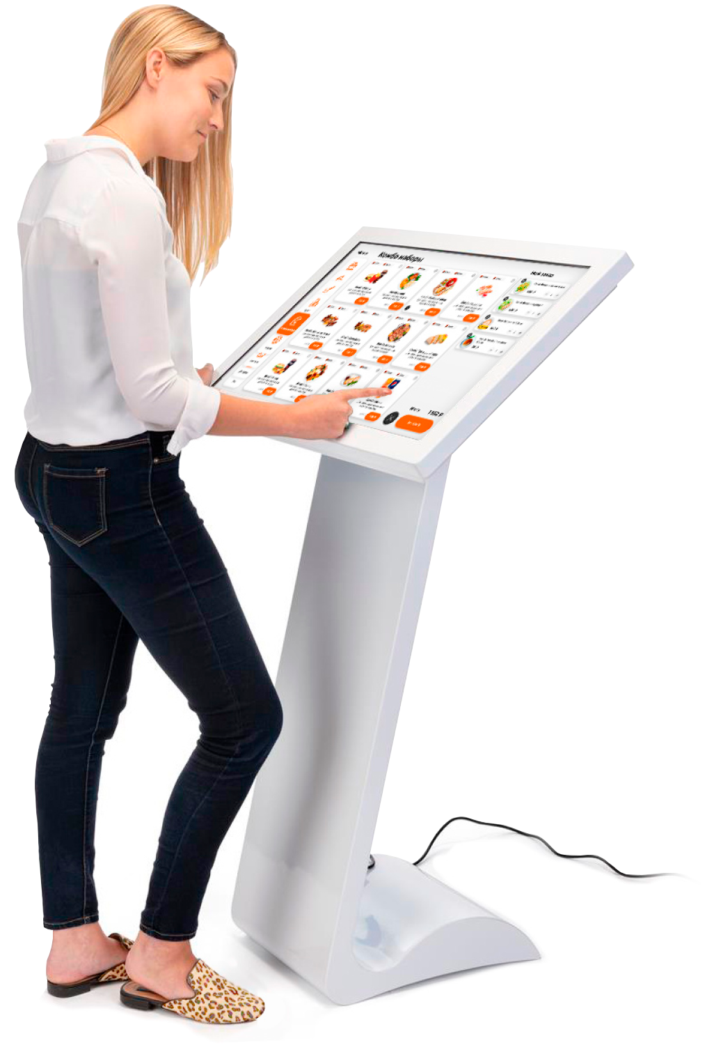

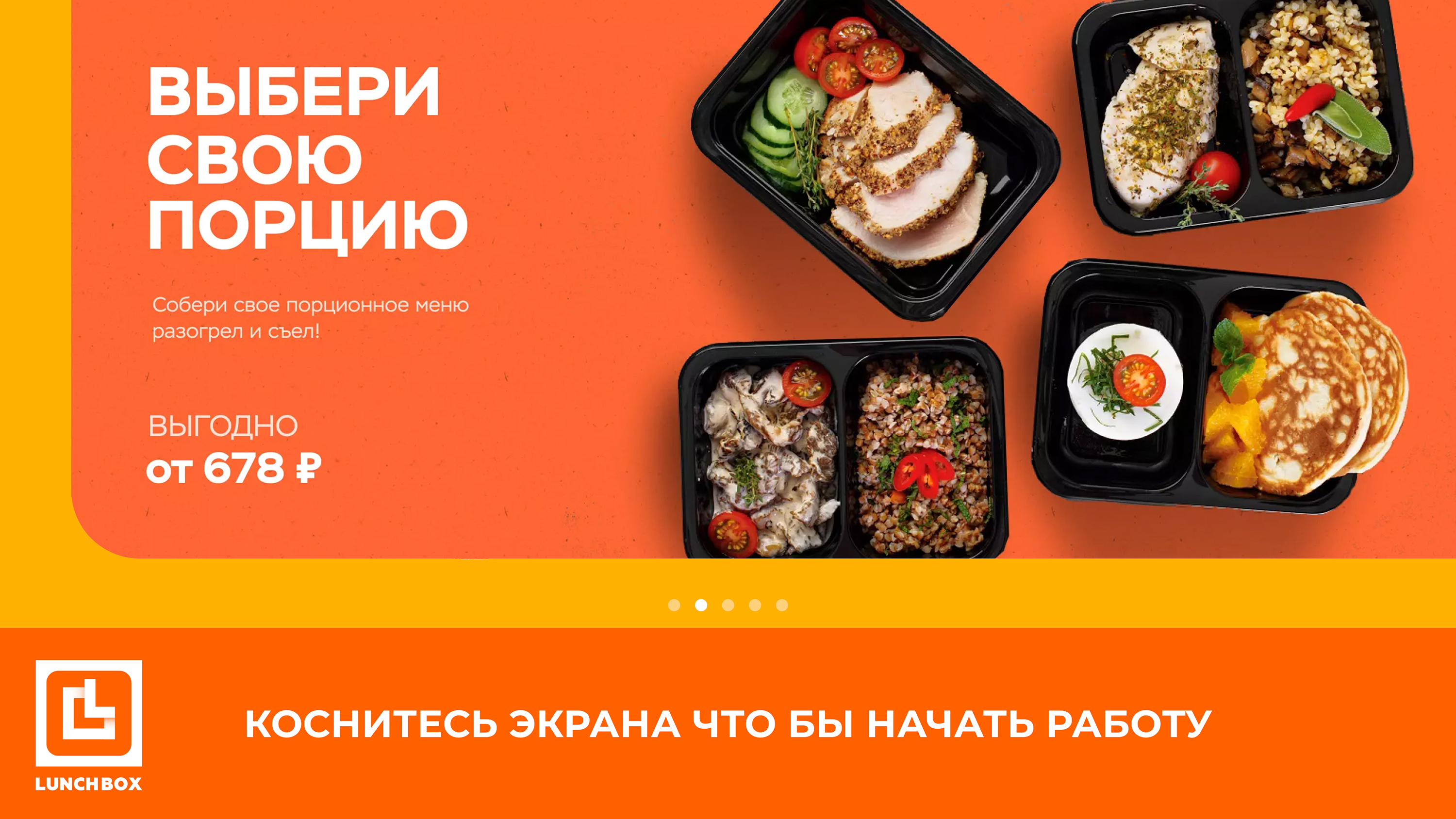
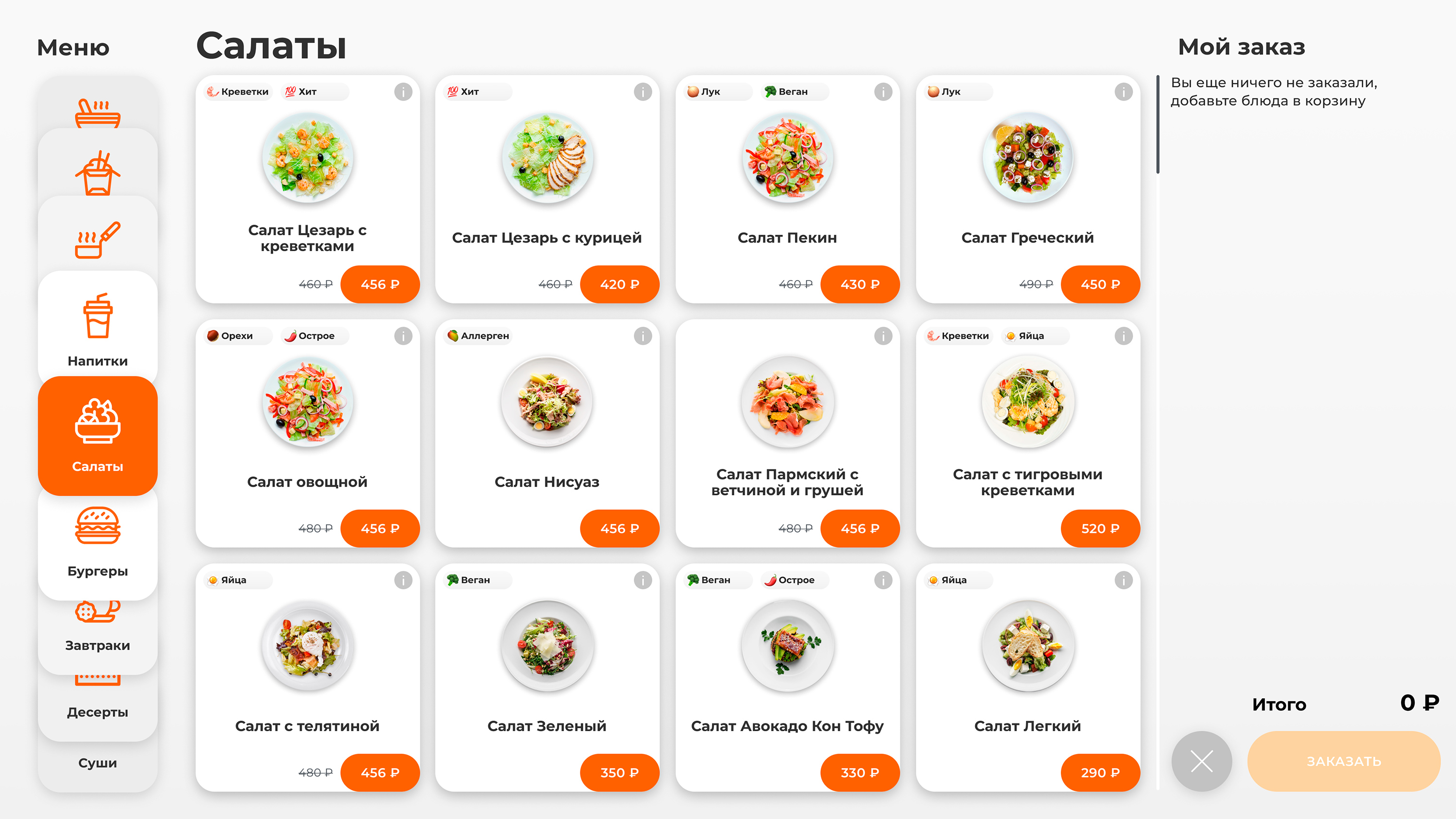
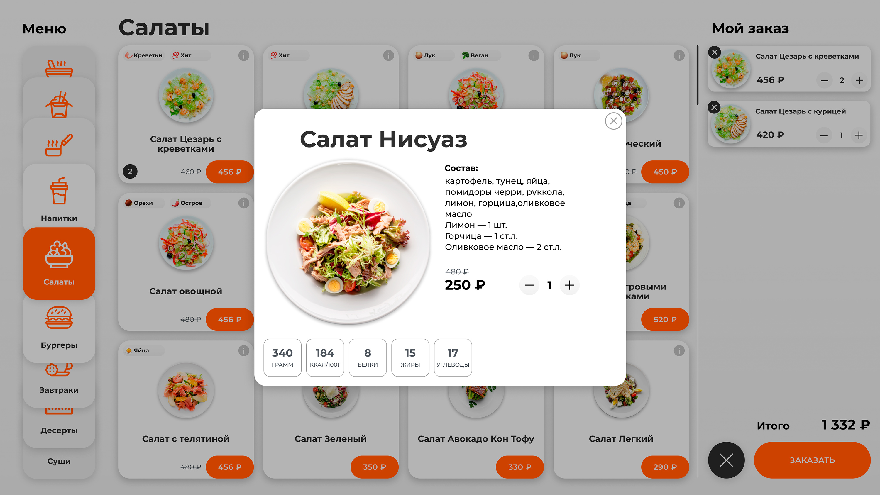
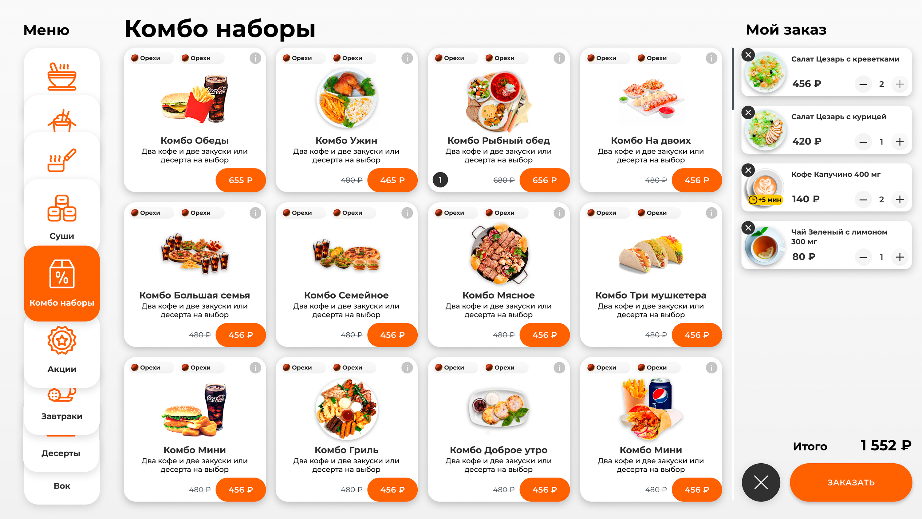
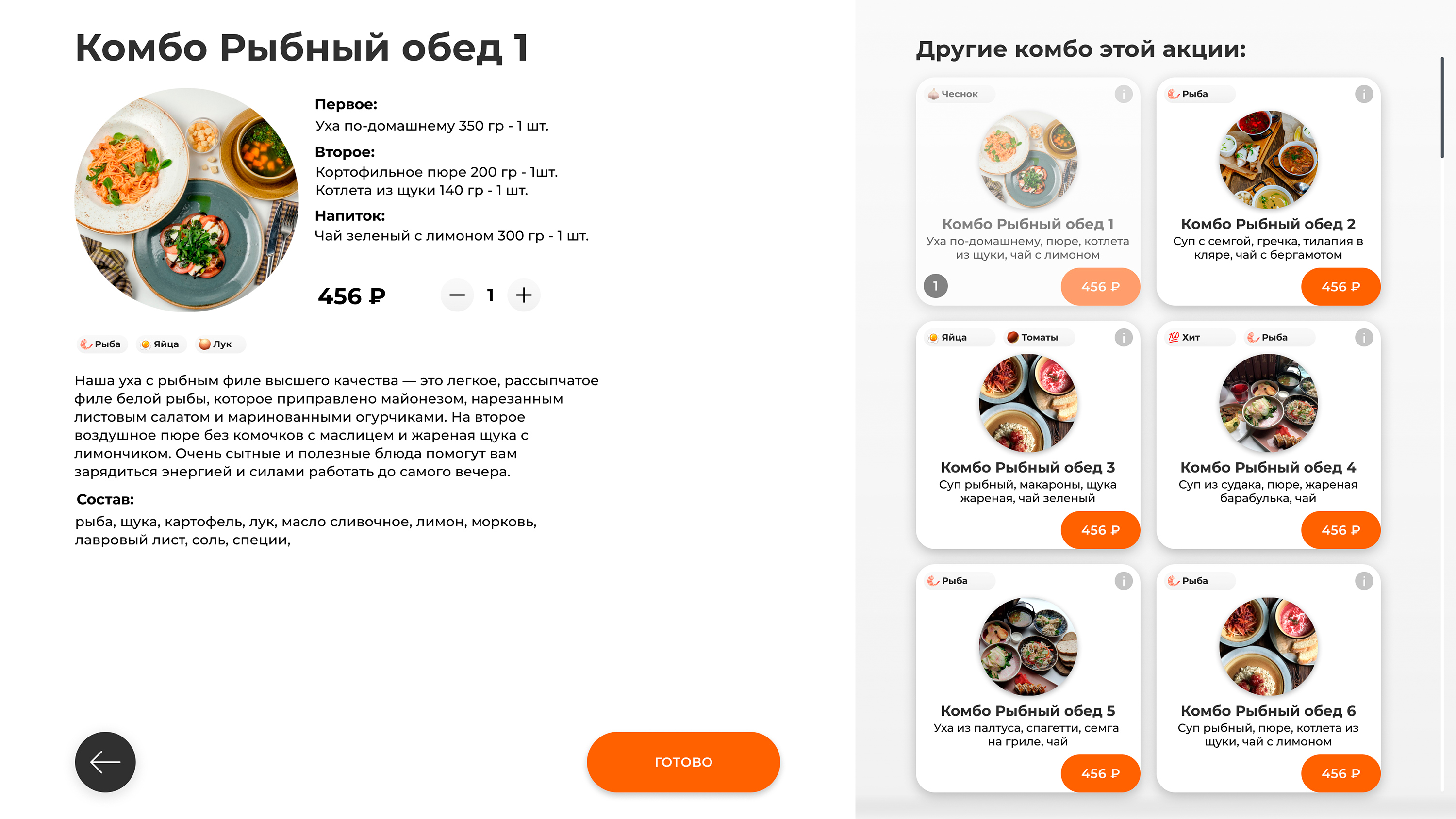
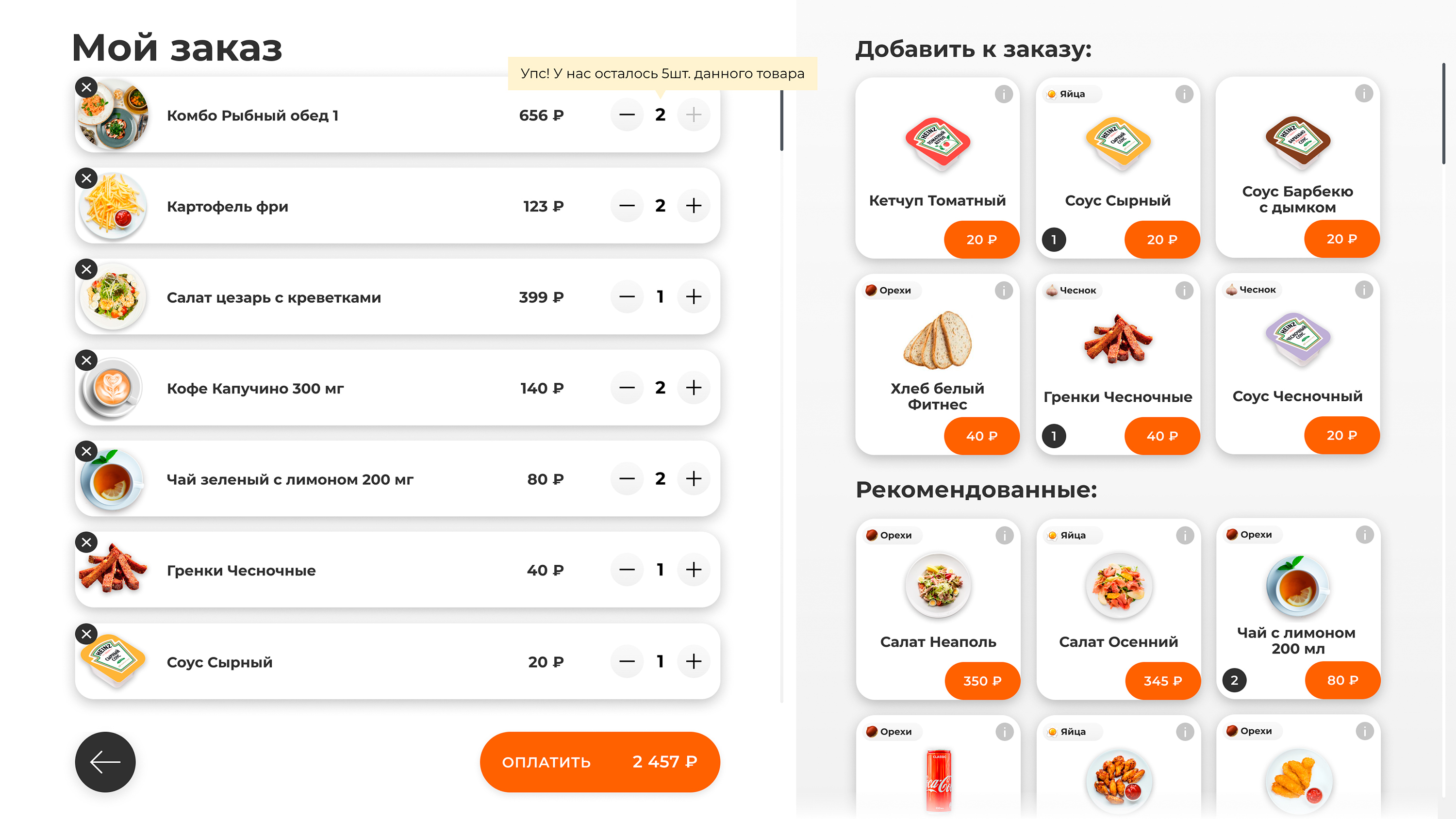
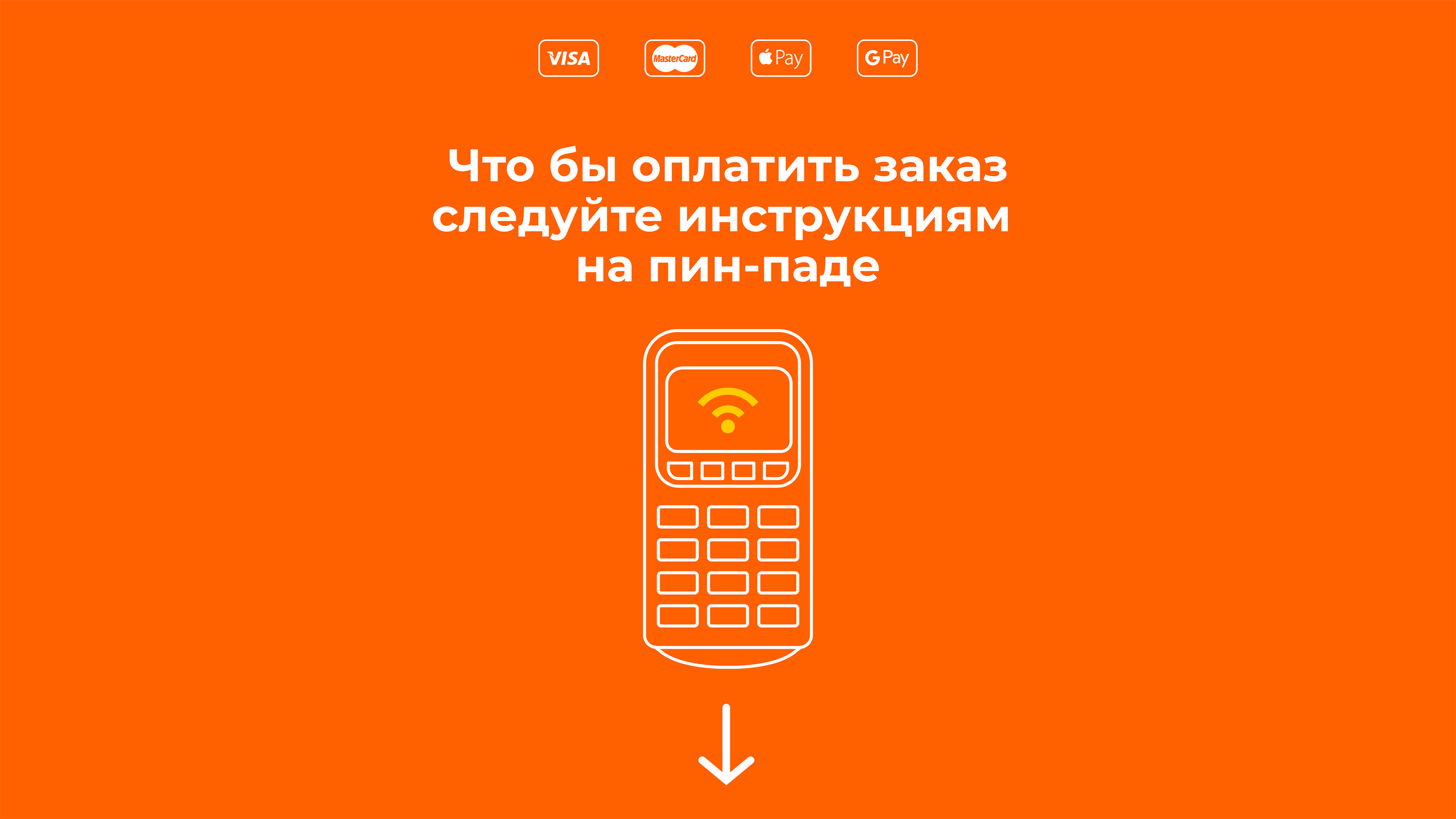
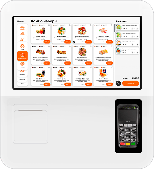
The main task in designing a self-service terminal for a cafe is to create an interface that allows the customer to make an order as quickly as possible. It’s better not to annoy a hungry person!
We took the mobile app as a basis, redesigned it for a different physical format (horizontal orientation, larger size of the touch panel) and the new type of interaction.


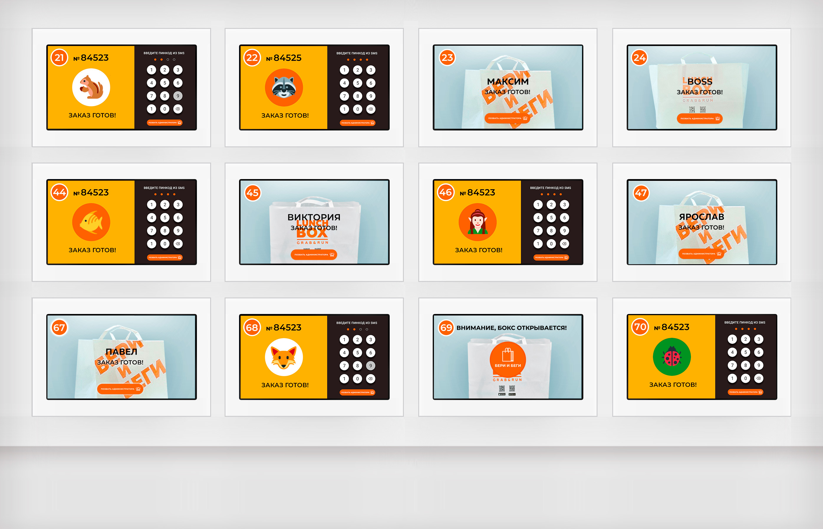
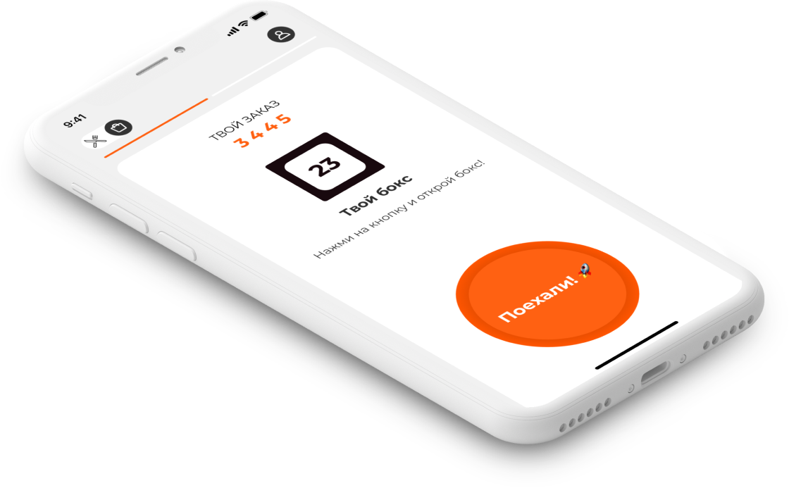
In the second iteration of LunchBox, the box displays are made using the technology of transparent panels with touch control. The image should be contrasting so that the customer can clearly see the box number, sticker and digital PIN input panel.
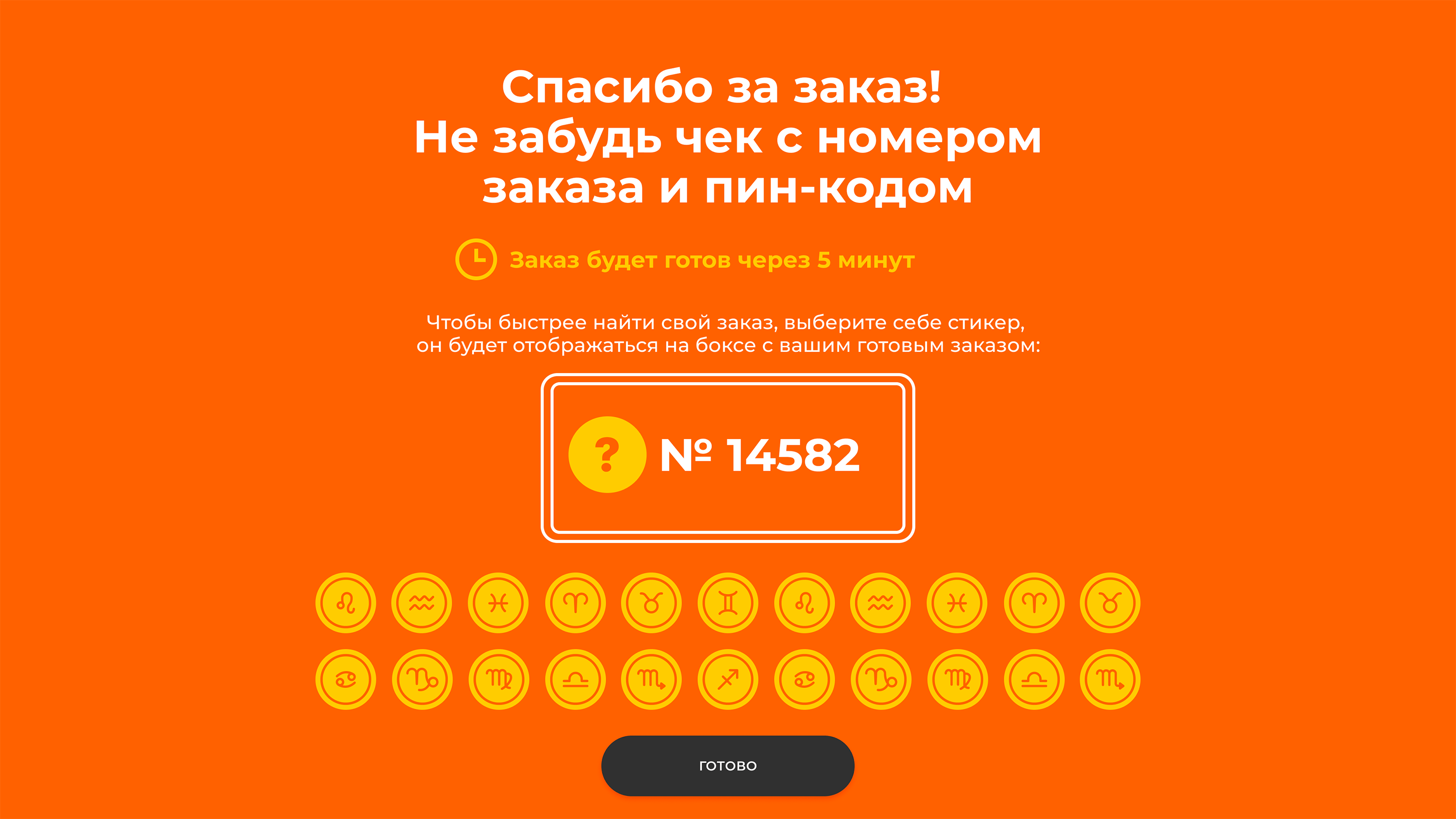
The sticker duplicates the box number for those who find it easier to remember the visual image. This helps a client to know the desired box among dozens of others and reduces the possibility of queues due to errors. So a simple picture increases the efficiency of the entire cafe.
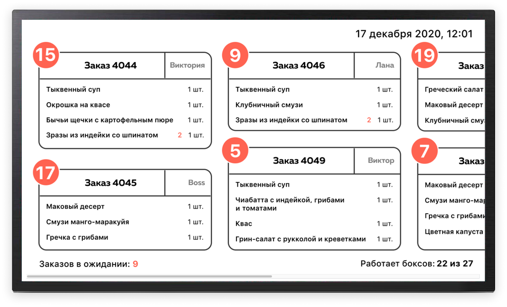
An additional task was to update the design of the boxes. We have applied new hardware modules, created a service panel for displaying the status of each box and updated the software part so that the complex of equipment works as designed.
