Shopping Mall "OZ MALL" Website and Navigation System
Shopping Mall "OZ MALL" Website and Navigation System
Task
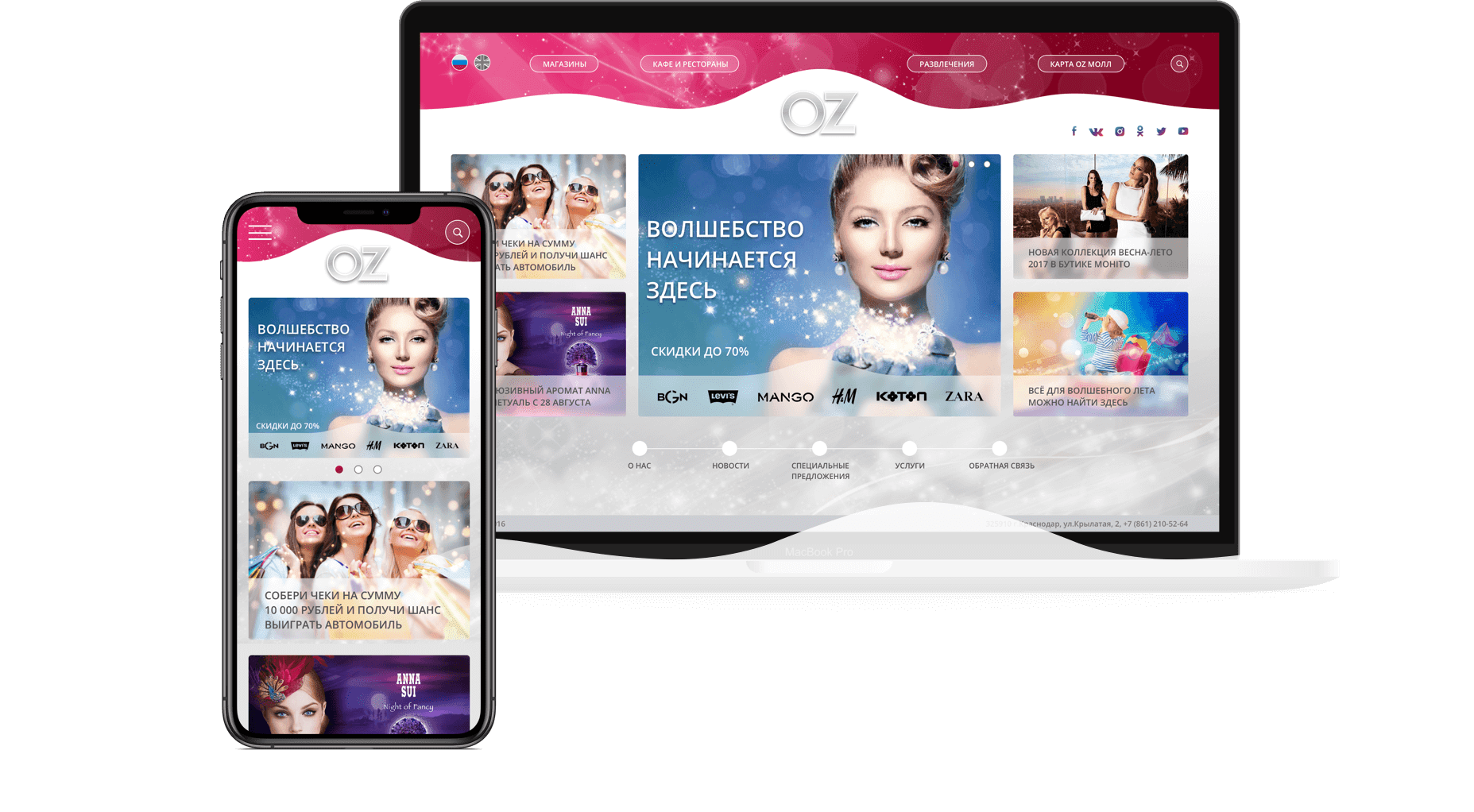
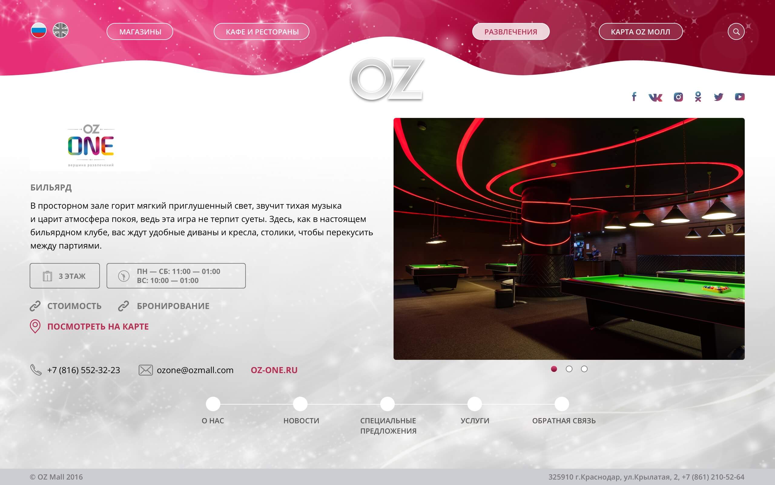
Our task was to develop a new website and redesign an interactive terminal navigation system inside the building for the OZ Mall. It is famous for being the most beautiful and largest shopping mall in the South of Russia. So we decided to implement brick-and-mortar beauty into online one for the benefits of its shoppers.Oz Mall Website
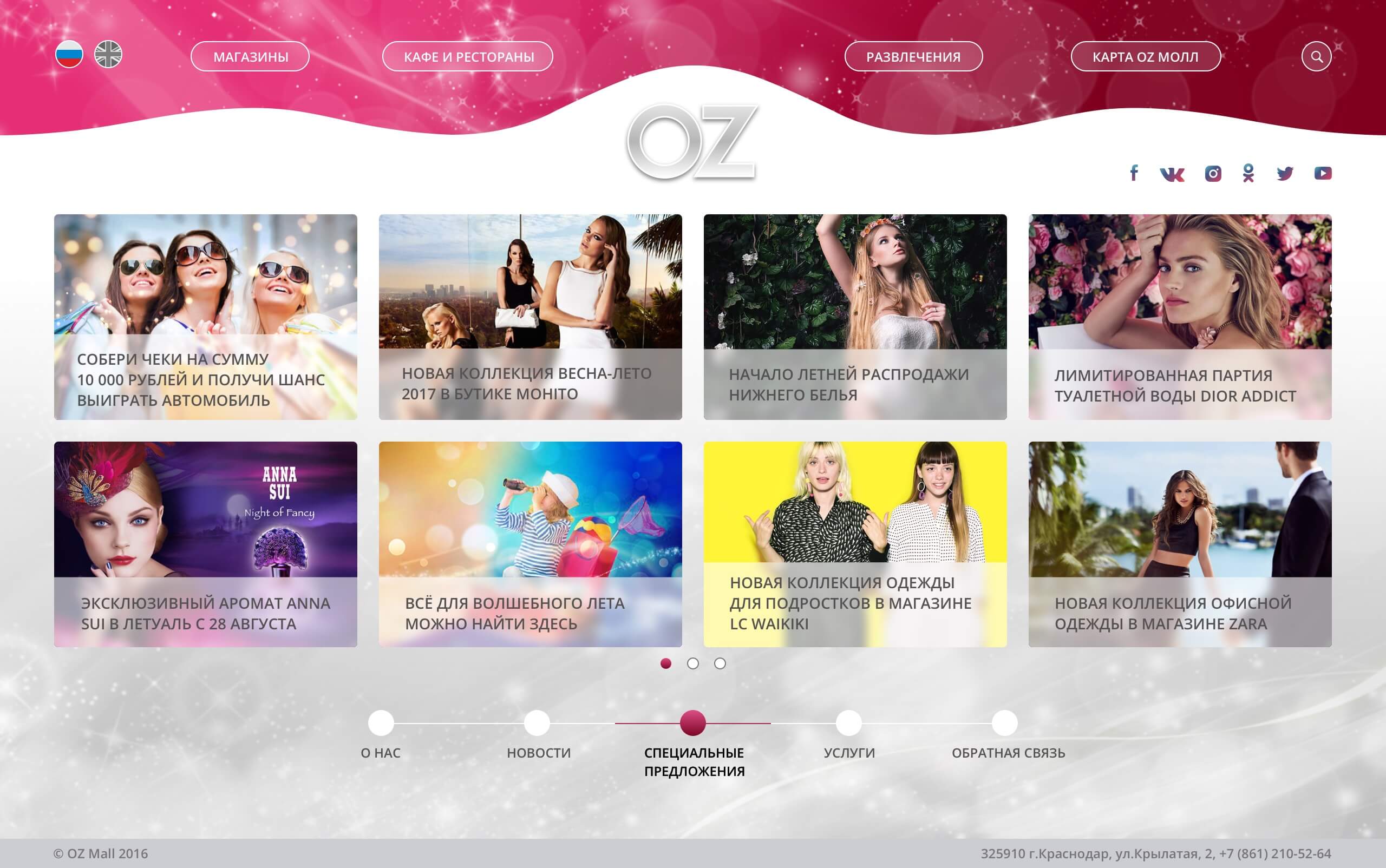
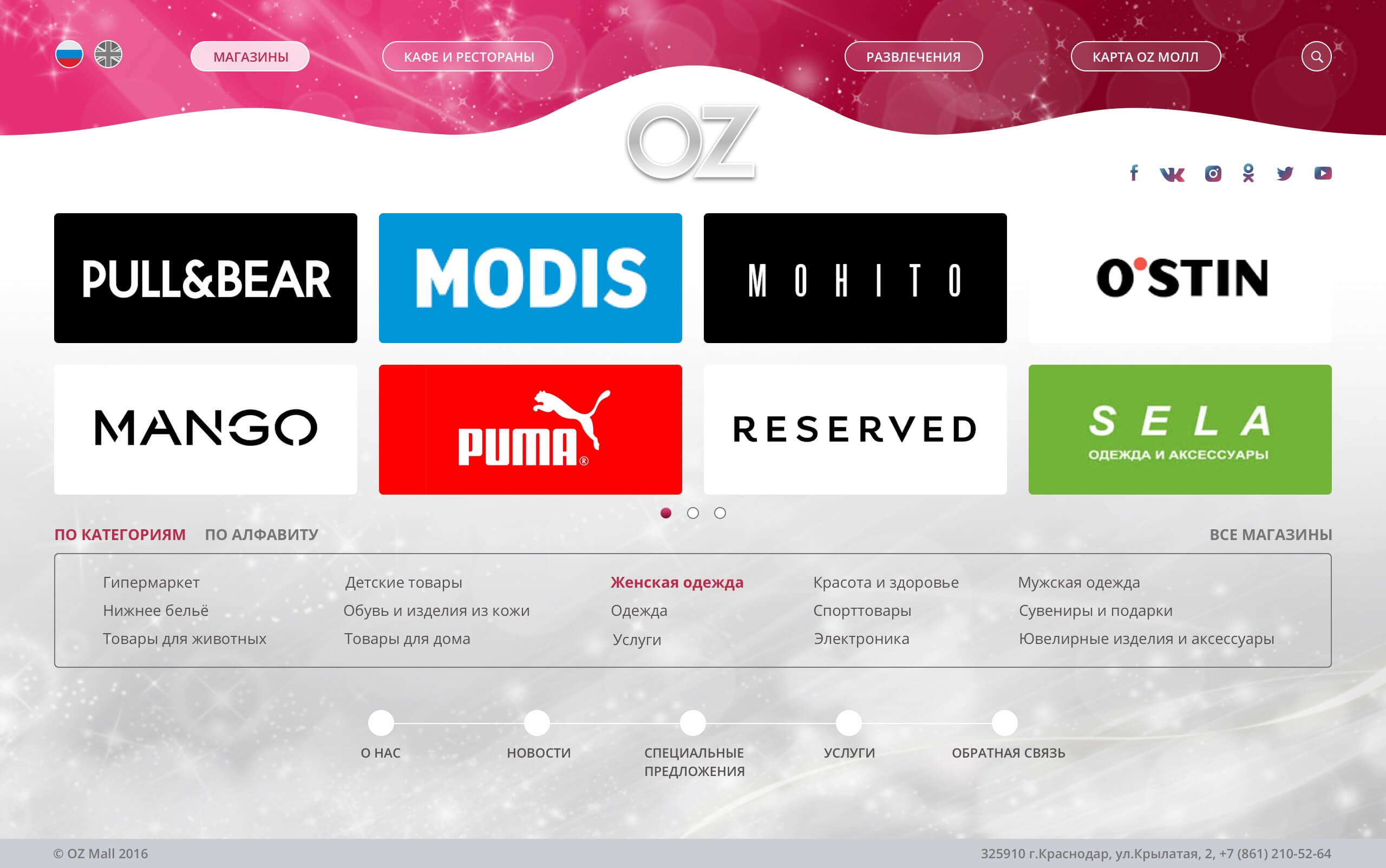
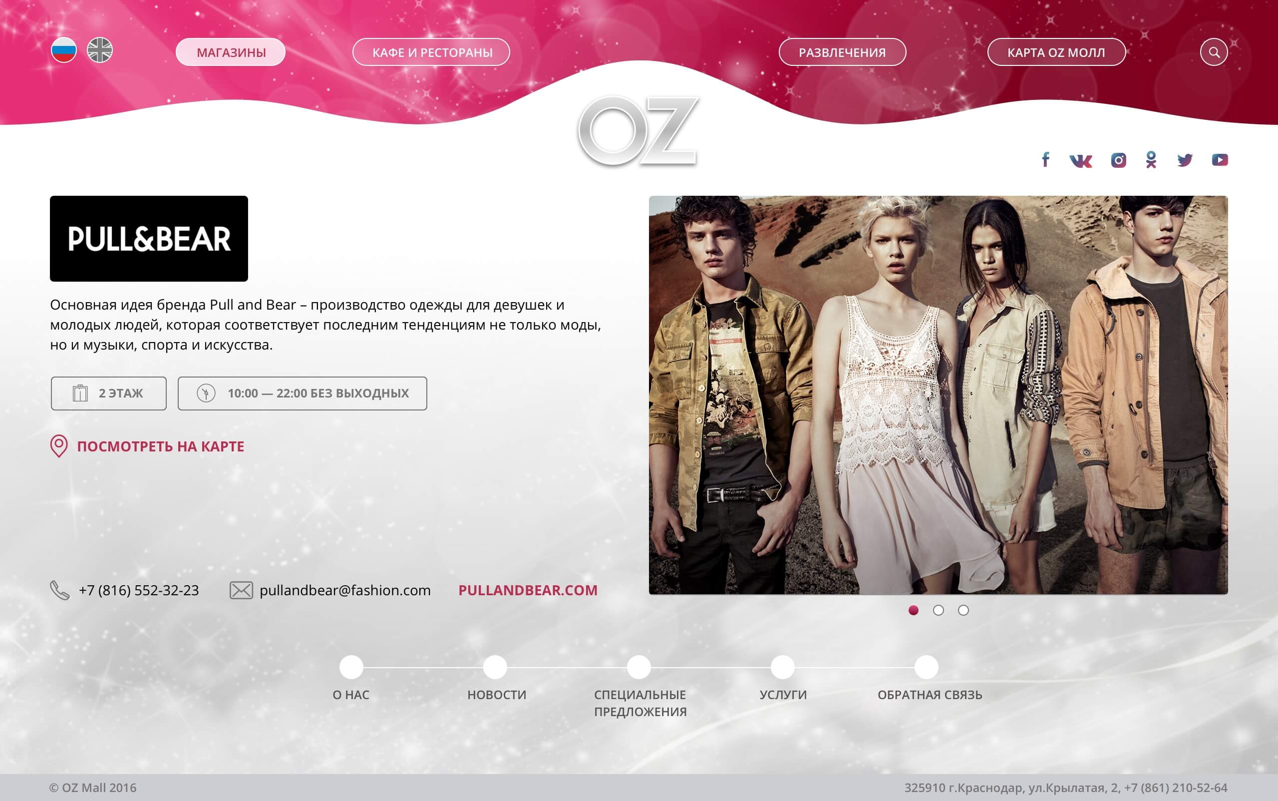
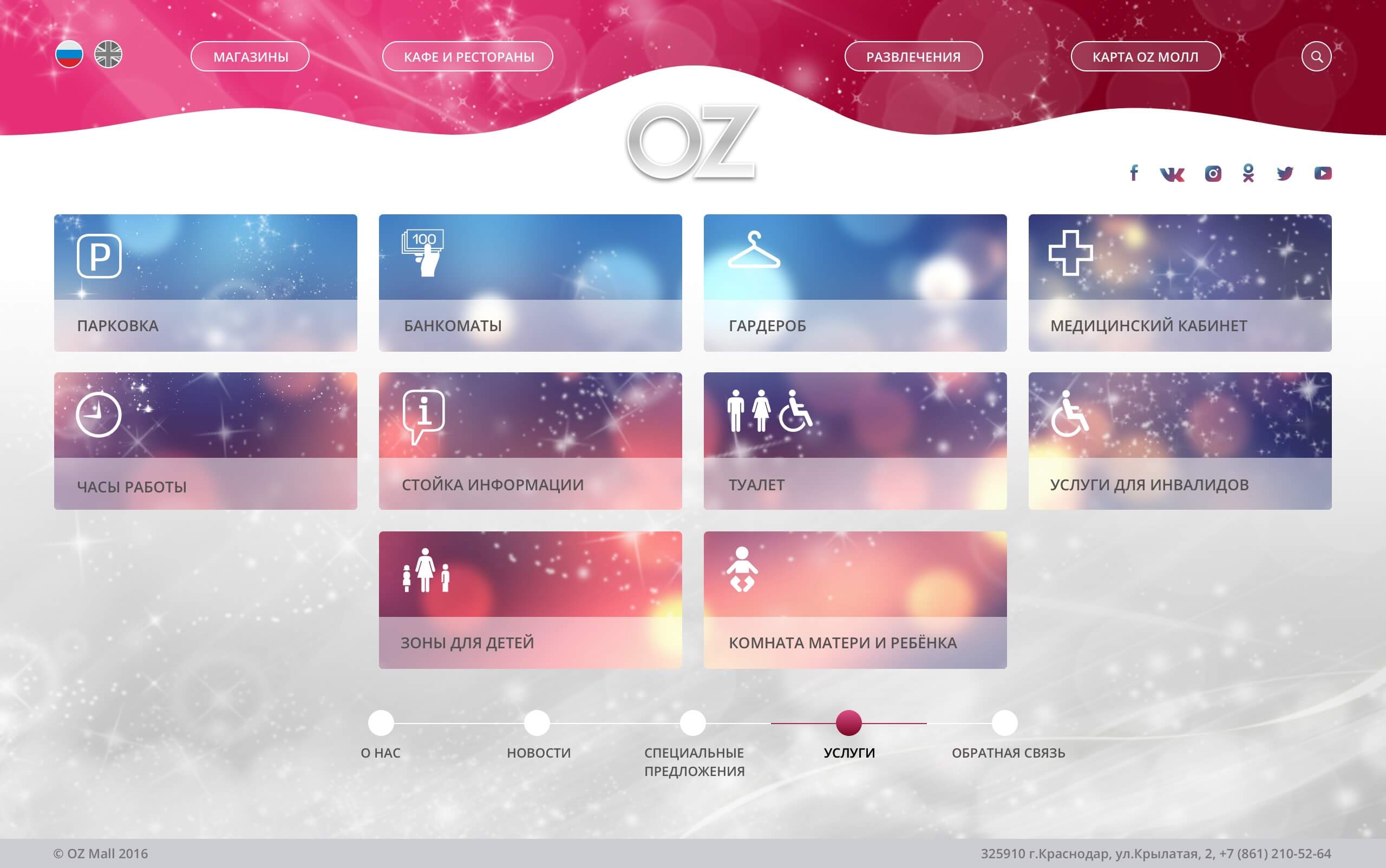
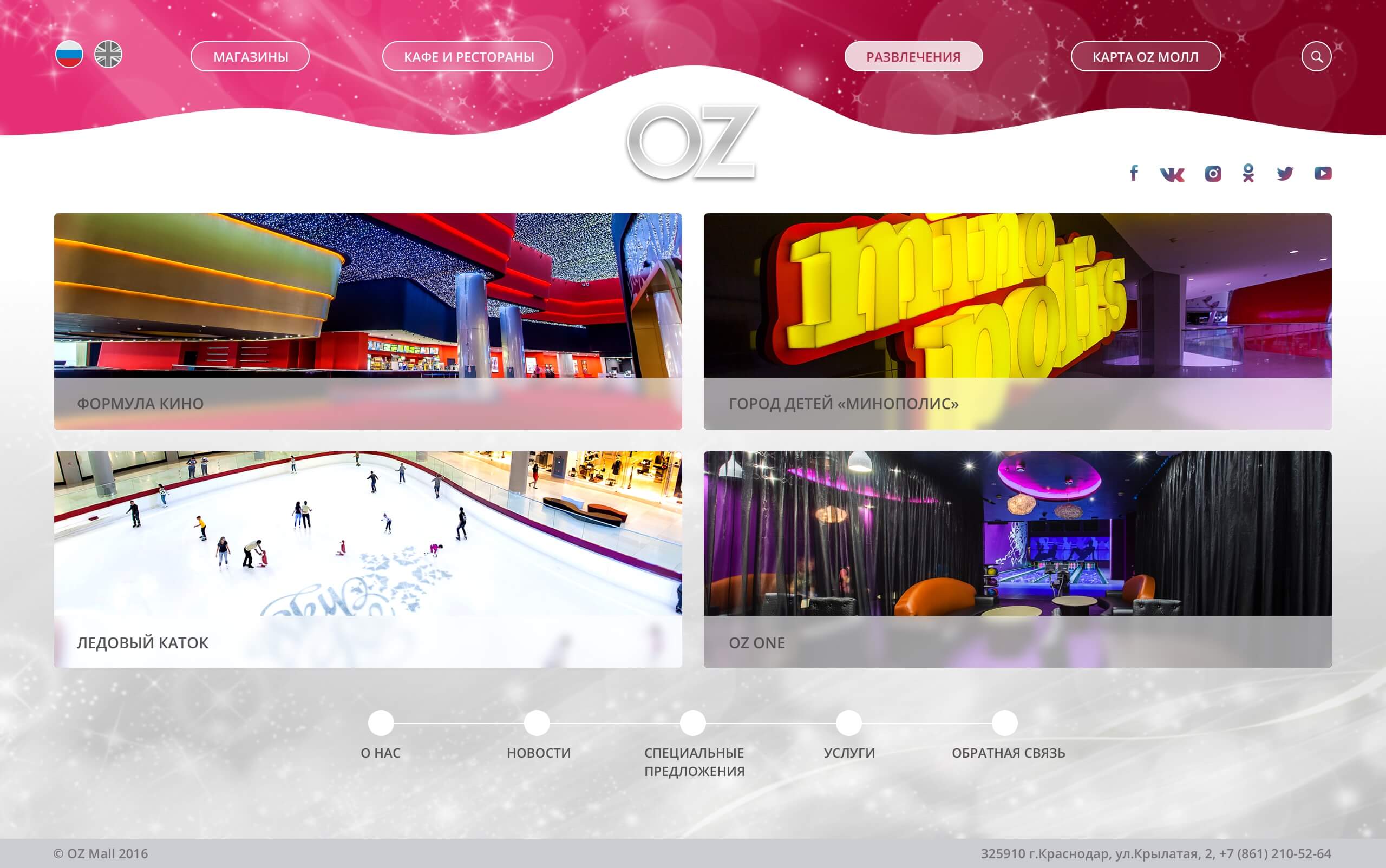
The client set the following requirements: the site should fit on the laptop screen without vertical scrolling; the gradient at the top of the site should be perfectly matched in color with the real neon; illumination on the facade of the building; the content layout should be similar to the layout in the printing booklet.
Oz Mall Website

Oz Mall Navigation System
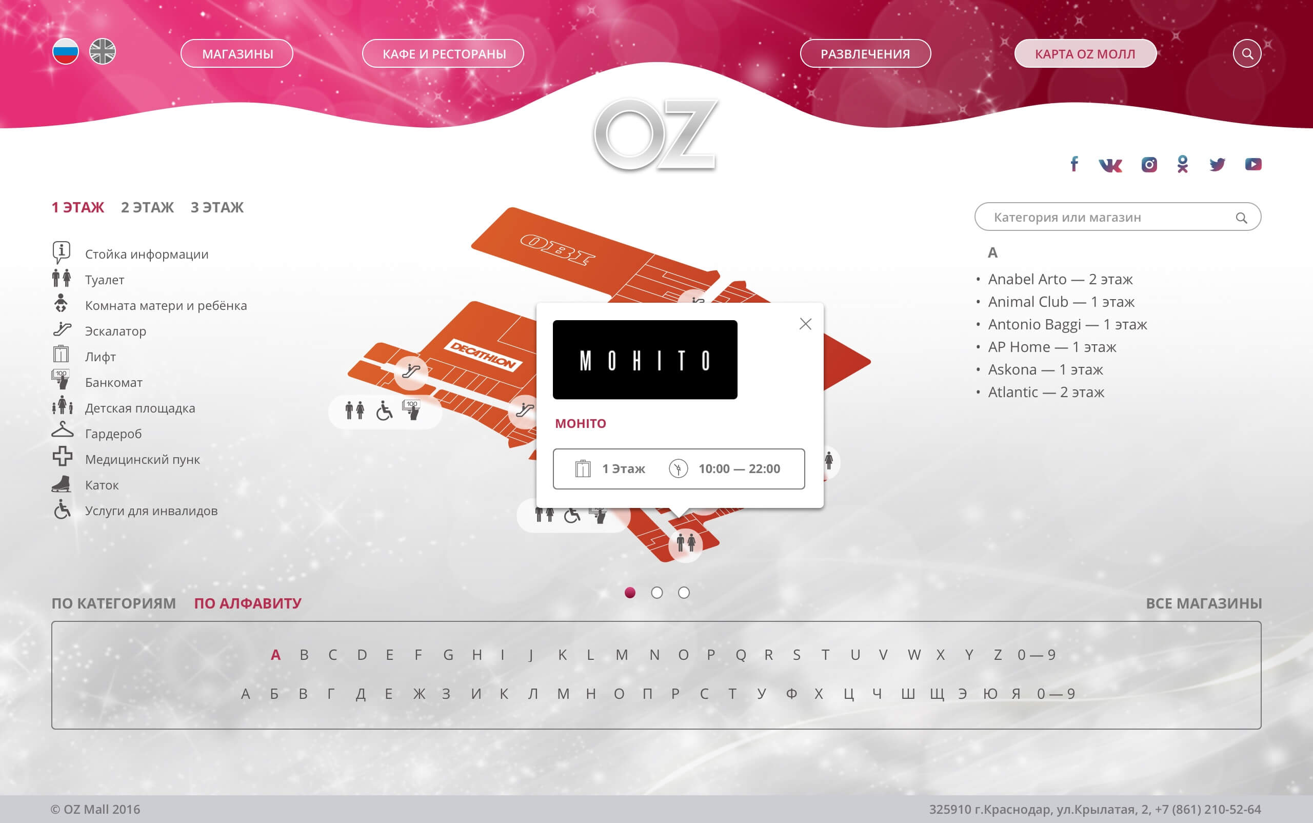
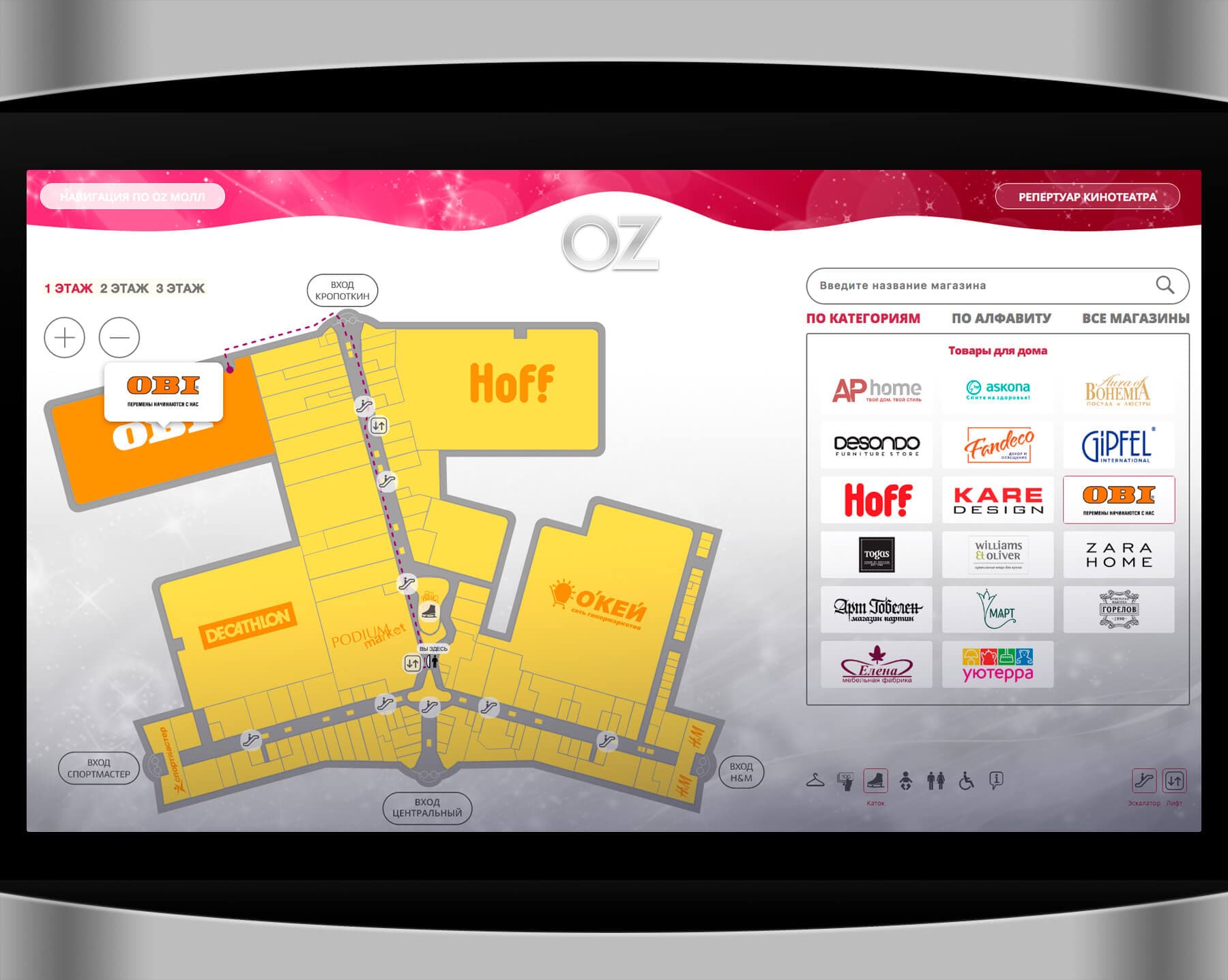
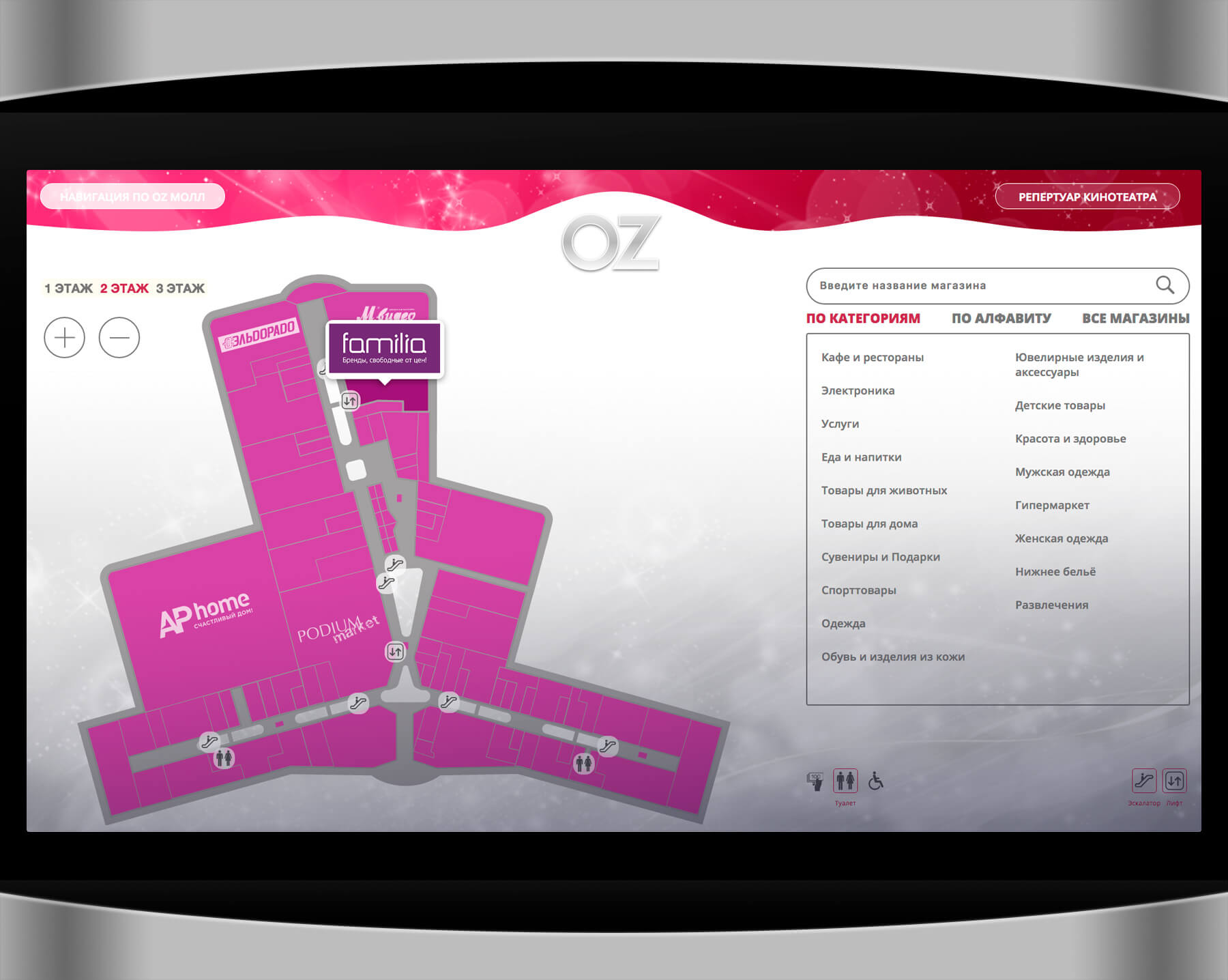
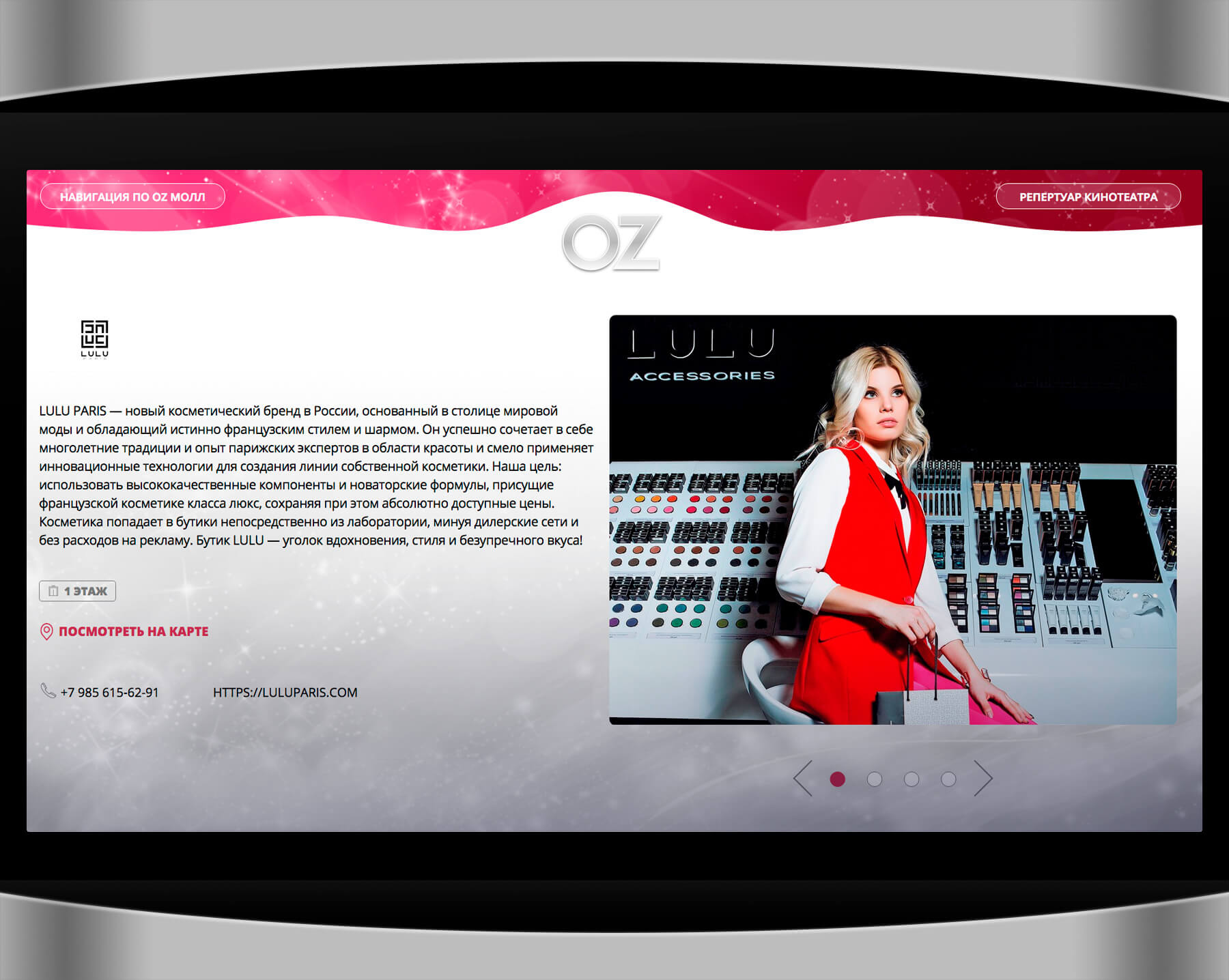
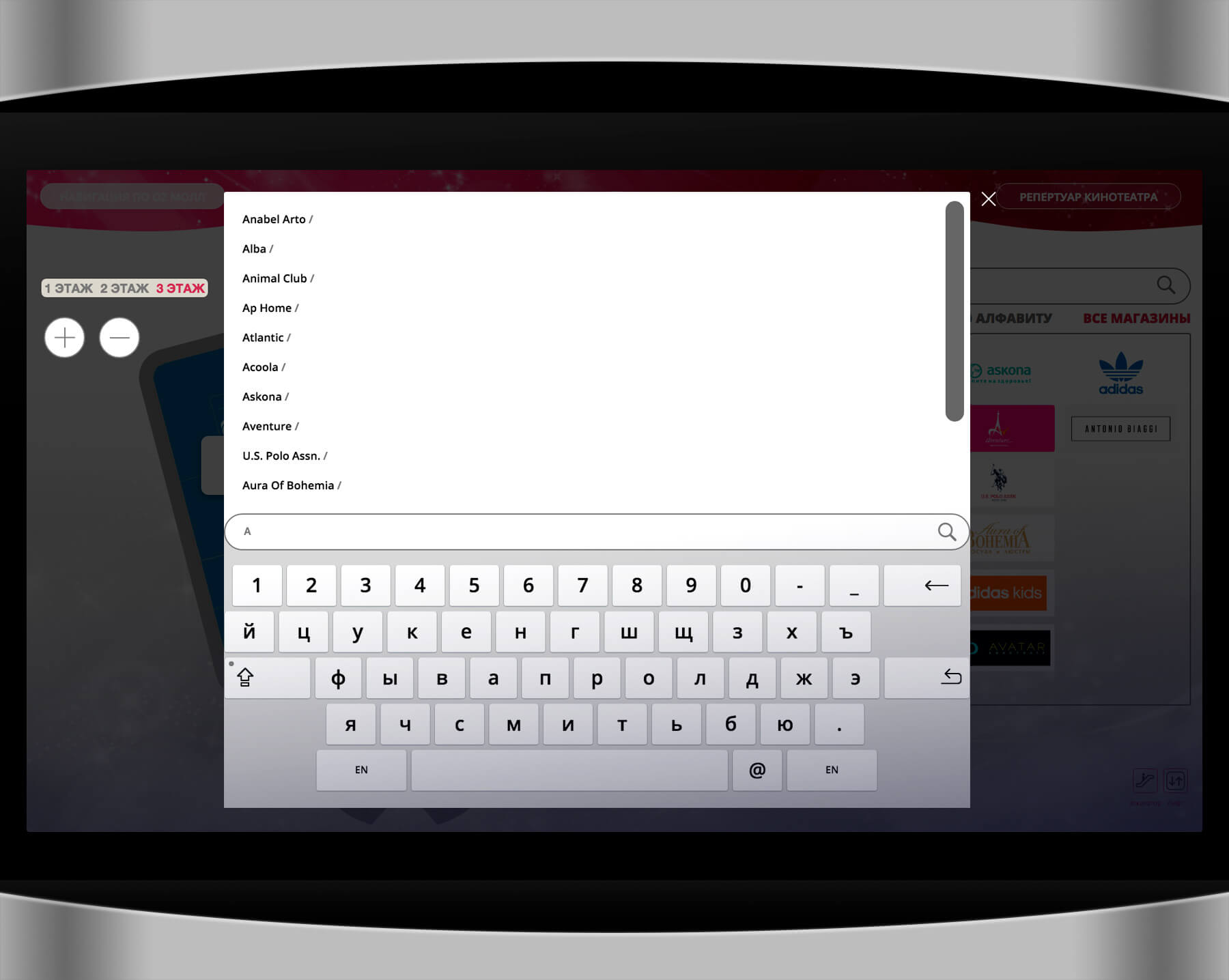
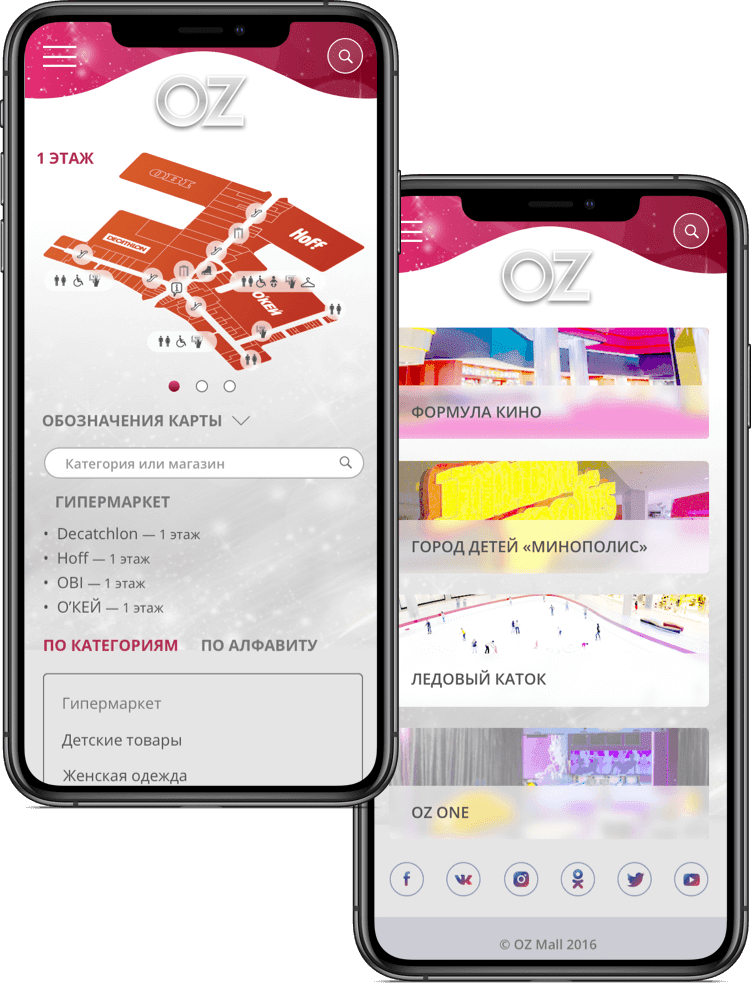
The design of the navigation interface should match the style of the OZ MALL site. You can find locations by name, category, or by selecting them on the map.
For the convenience of mall visitors, we have completely redesigned the system of interactive navigation through the shopping mall. The main task is to help the visitor quickly find the store (cafe, toilet, etc.) and show them the shortest path. From the terminal to the selected object, an optimal route is laid,
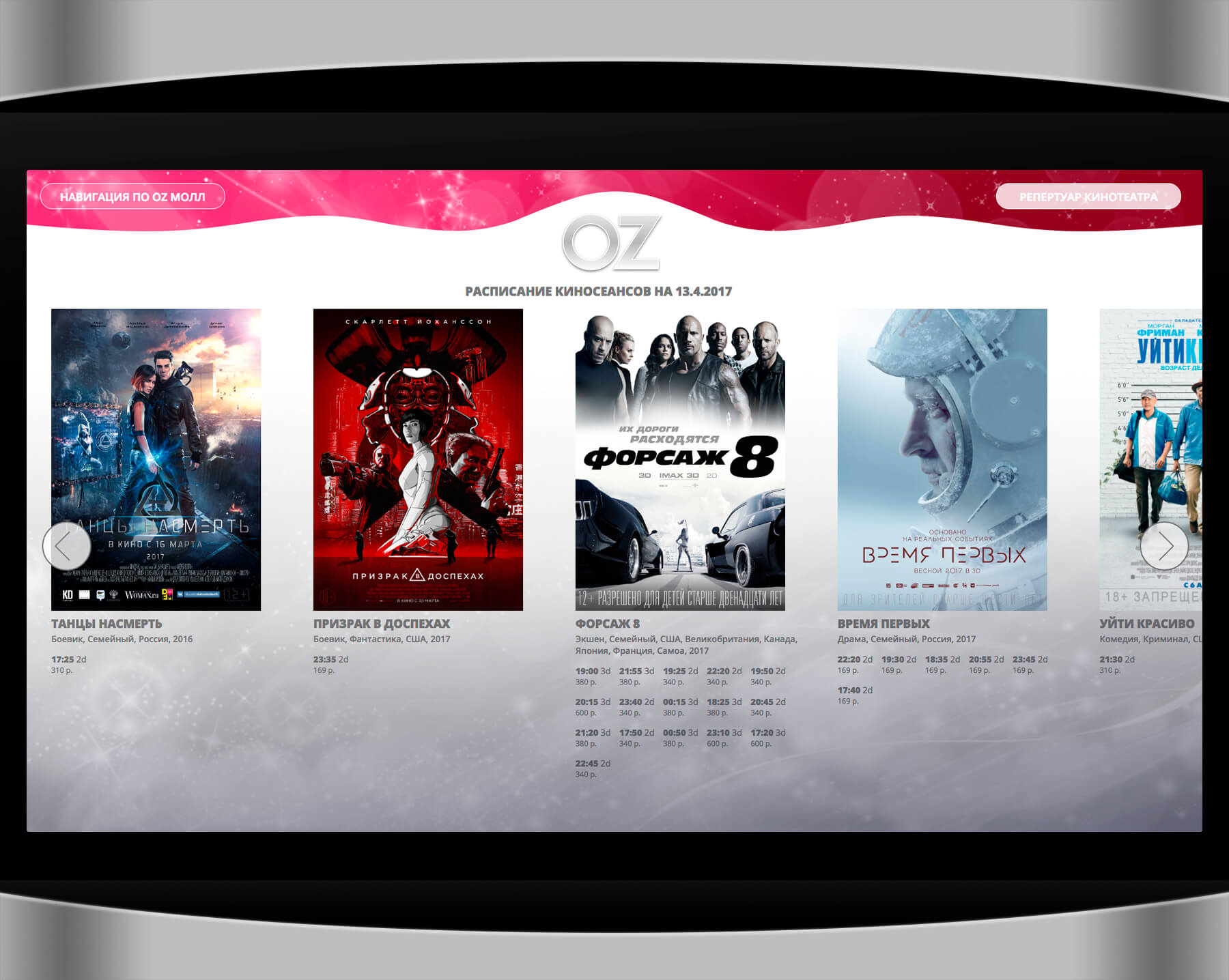
taking into account transitions to other floors. For each store, you can get comprehensive information. In addition, a cinema poster with the upcoming movies is displayed on the terminal. Advertising banners are displayed when the terminal screen is inactive
Control System
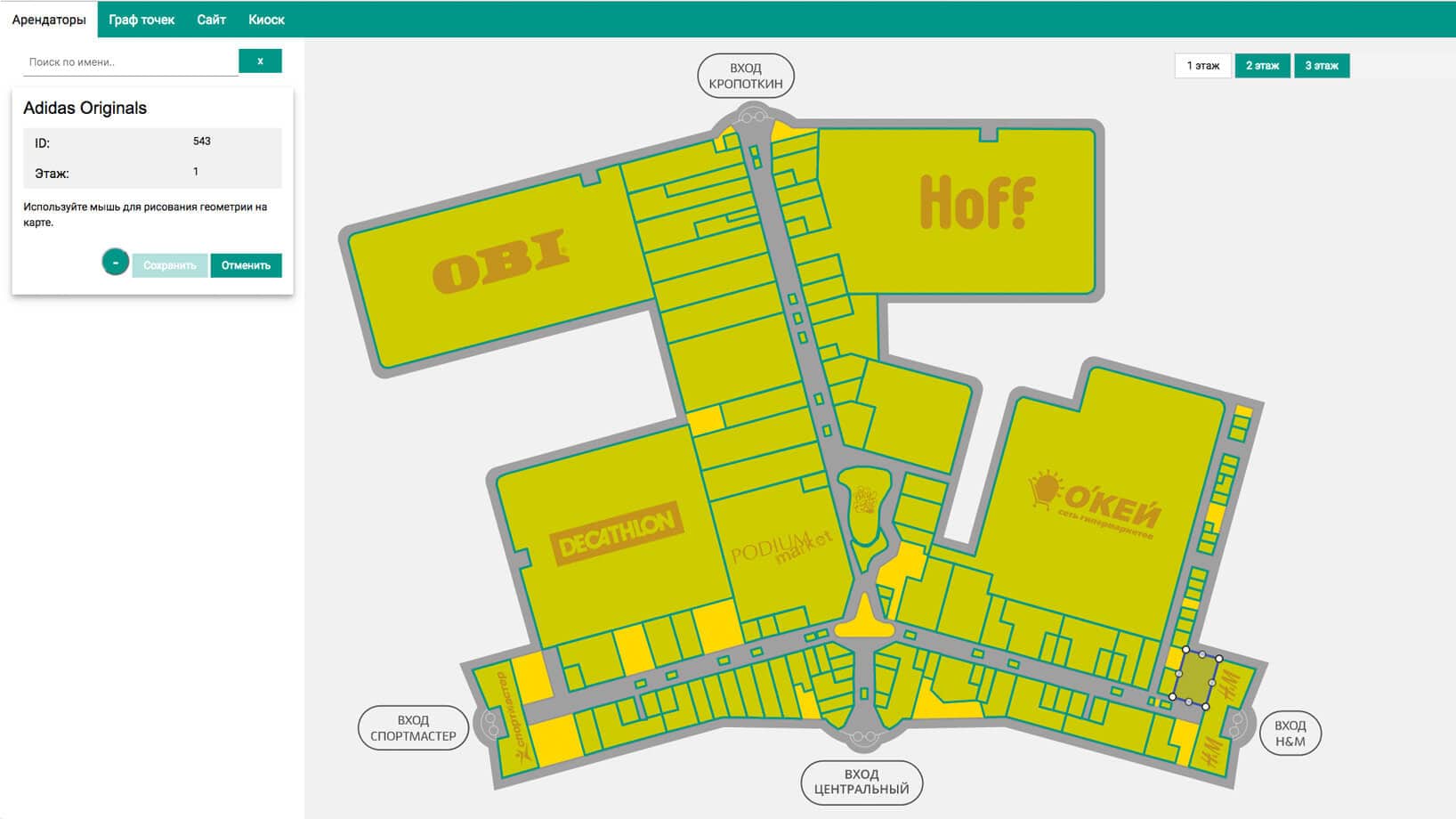
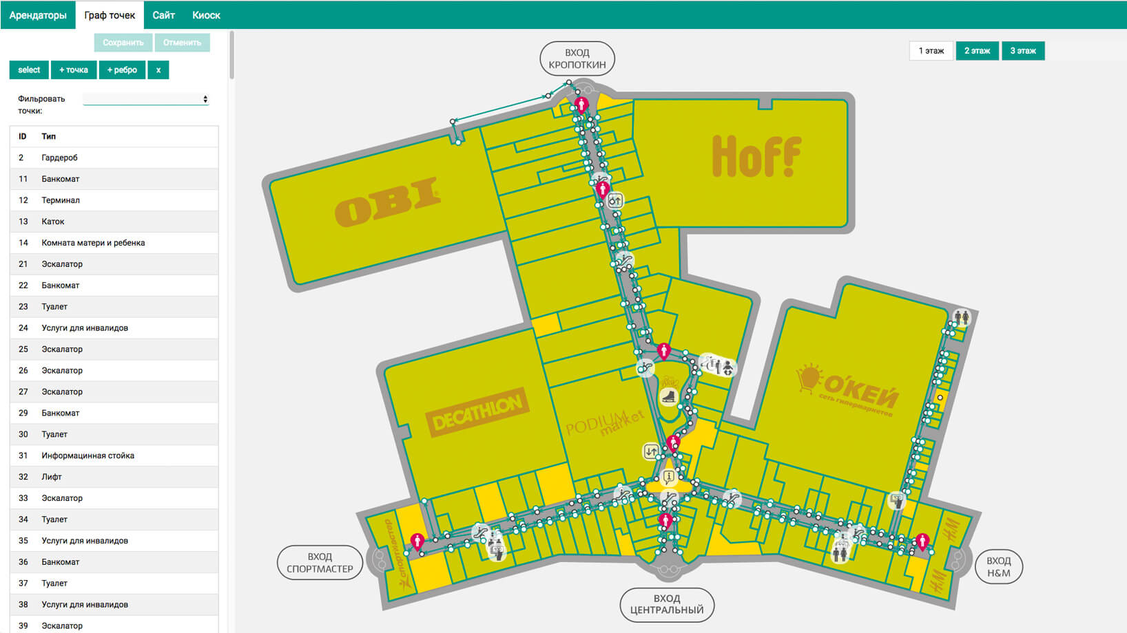
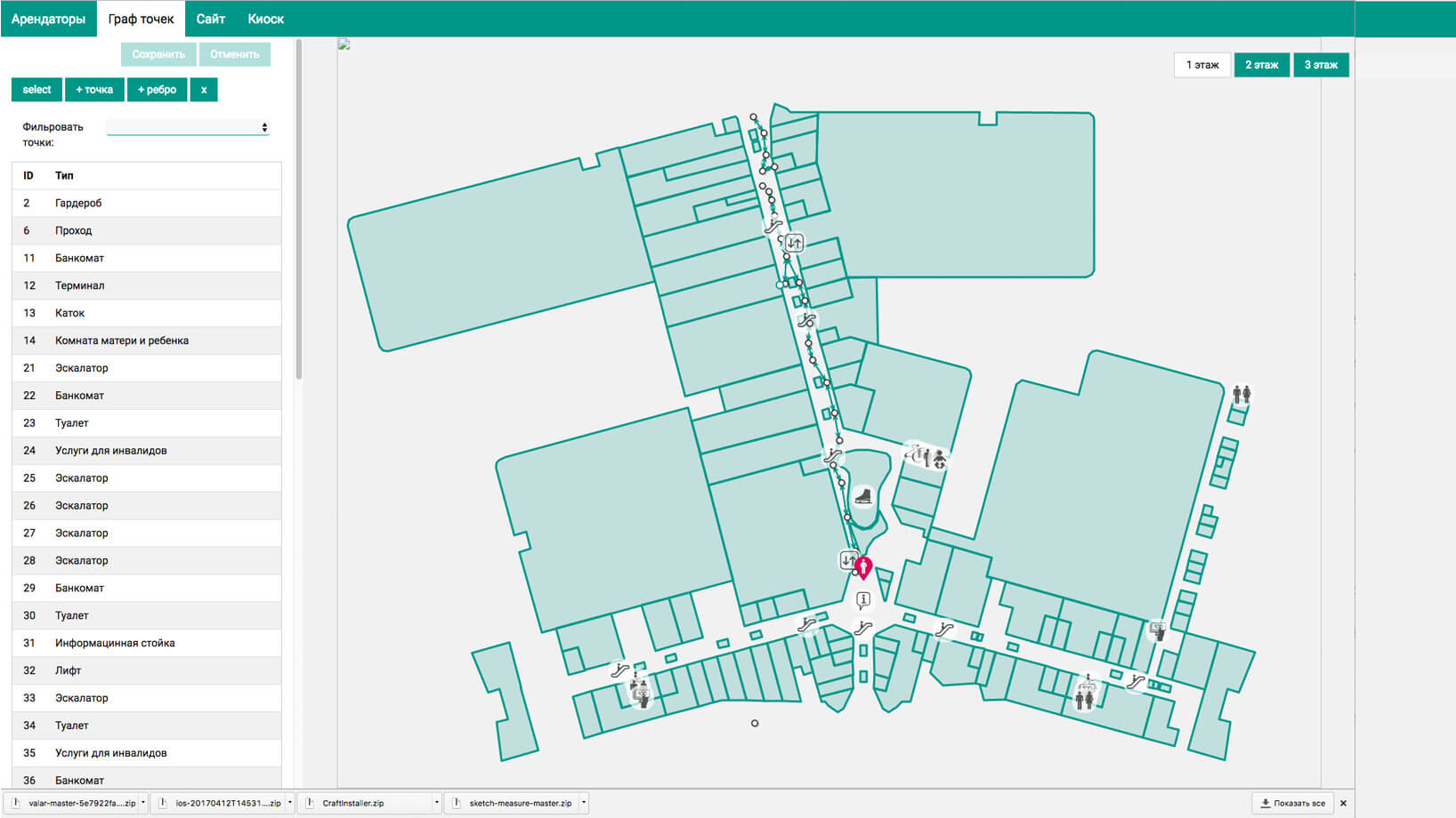
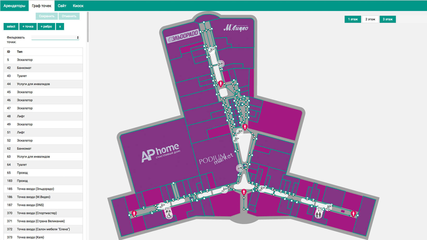
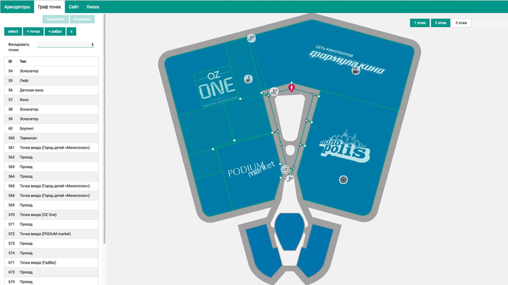
Site administrators manage content through the administration system. The navigation system data is managed through a separate web application with a plan editor.
For the administrators of the navigation system, we have developed a web application with special editor where you can quickly change the placement of tenants and infrastructure, adjust store layouts and movement trajectories.

