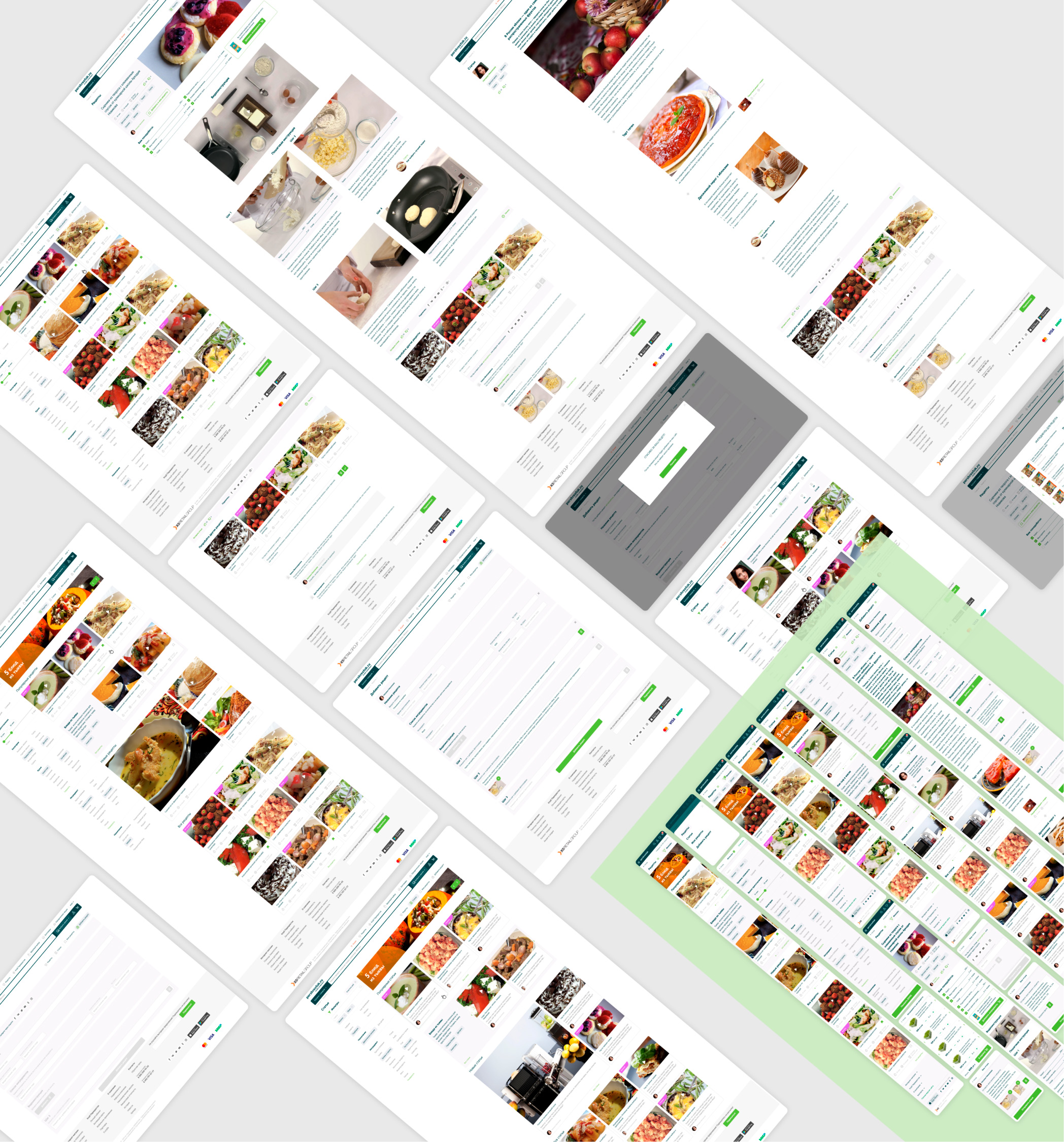
The UX and UI of the "Recipes" section of the "Perekrestok" online supermarket
Client: X5 Retail Group retail chain

Perekrestok is the X5 Retail Group retail chain, the leading supermarket for high quality fresh produce in Russia. There are more than 900 stores, thousands of products and excellent customer service.
The chain continues its lightning-fast development in the online retail niche, offering customers not only delivery, but also gastronomic ideas.
A task
- To design a section with over 20,000 recipes
- To simplify the search for the desired recipe by different parameters
- To develop the user interface of the section in accordance with the requirements for the UI of the Perekrestok’s main website
Result
Desktop version
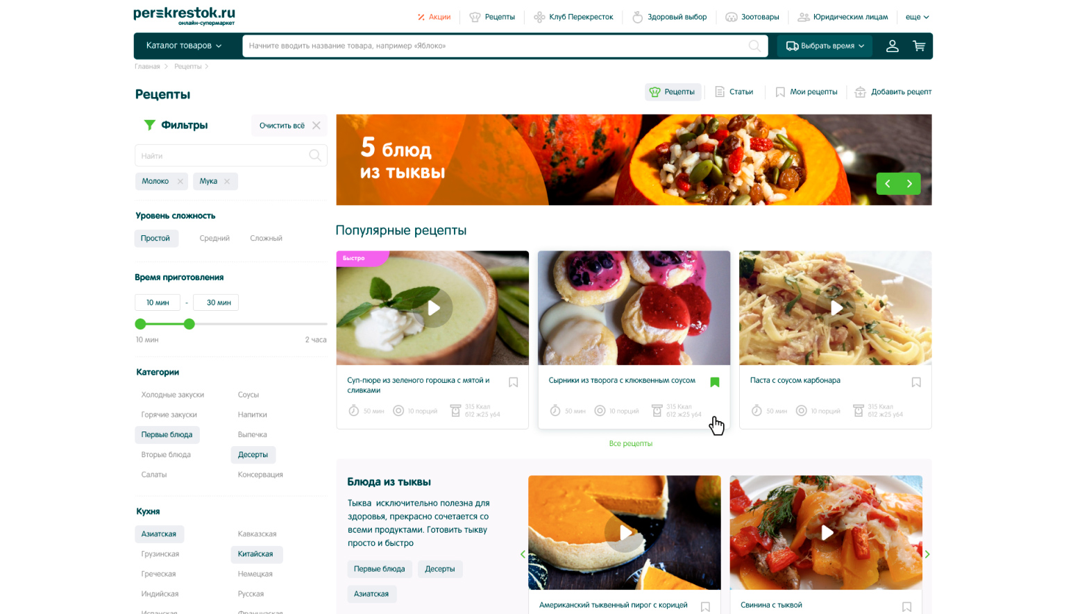

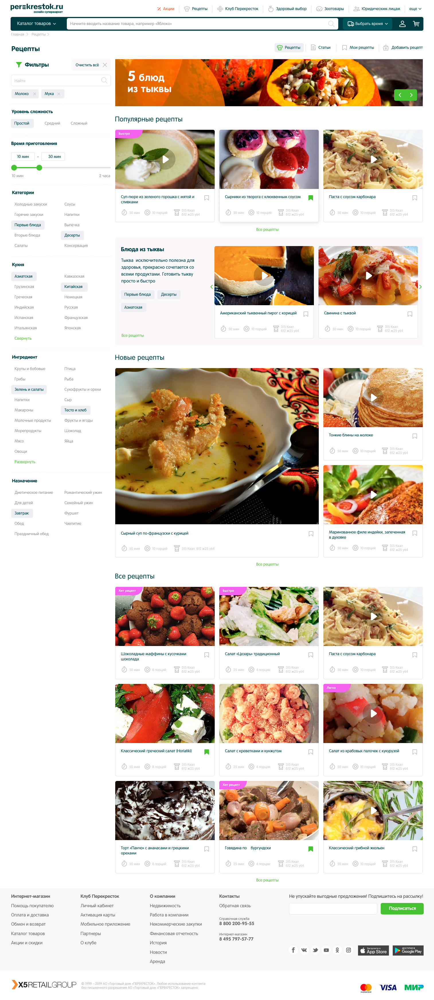
The large number of recipes in the section underlines the need for a convenient search and filtering tool. This is one of the main functions of the website. The user can choose the type of cuisine or dish, ingredients, cooking time, difficulty level, and the site should instantly offer relevant results.
The peculiarity of faceted search is that with each selected parameter, only available filters remain in the list, excluding the possibility of an empty result and a dead end in the user's path.
In addition to the recipes, the site has a section of articles by famous food bloggers with a selection of recommended dishes.
Each user can have a collection of their favorite recipes and share their own findings.
Each recipe has reviews and the ability to instantly order all the ingredients in the online supermarket.

Mobile adaptation
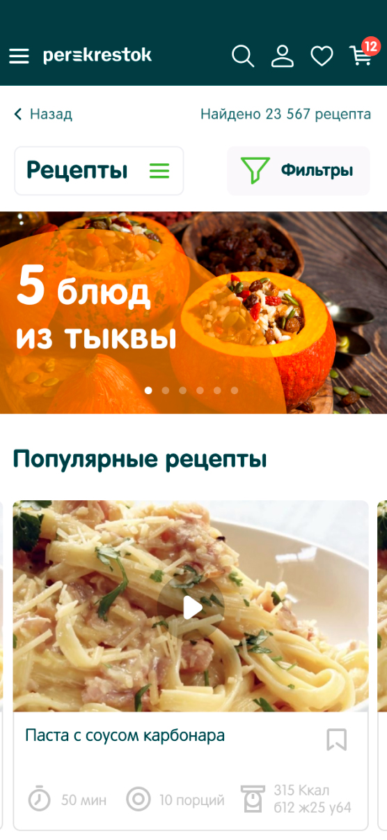
In the mobile version of the section we have saved convenient filters and displayed them on a separate screen. After selecting the desired items, tags appear at the top of the recipe list. This allows you to quickly preview your selection and delete unwanted tags with one touch.
Prototypes and layouts
The customer received prototypes and layouts for desktop resolutions of 1440px, 1000px and mobile version — 320px.
